Have you ever needed to send money to someone just once—a random vendor, a friend in need, or an organizer for an event? You open your banking app, expecting a quick transaction, only to be greeted by an extra step: adding them as a beneficiary. It’s like being asked to save a stranger’s phone number just to send them a single text. Frustrating, isn’t it?
This is one of the key usability issues in the MYPrime app, where sending money becomes unnecessarily complicated for one-time transactions. In a world where speed and simplicity are king, this extra hurdle feels out of place and disrupts the flow of what should be an effortless process.
In this article, we’ll dive into the usability issues of the app, highlighting the hurdles that customers face while using it and exploring how these challenges impact the overall user experience. By analyzing these issues, we aim to shed light on how Prime Bank can create a more intuitive and user-friendly application.
1. The Frustration of Mandatory Beneficiary Addition
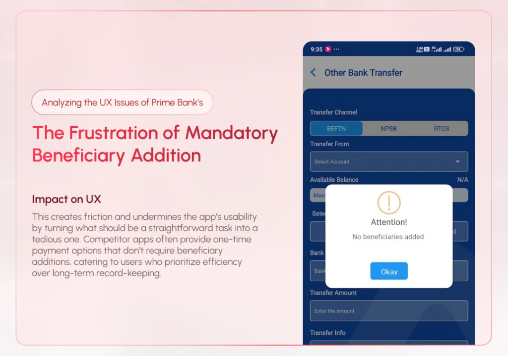
One of the most glaring issues in the MYPrime app is the requirement to add a beneficiary before transferring funds. It doesn’t align with the expectations of today’s users, who demand speed and convenience.
Consider a scenario where a user needs to send money urgently to someone they will never need to pay again—such as a one-time vendor, an event organizer, or a new acquaintance. The current process forces users to go through multiple steps to add the recipient as a beneficiary before completing the transfer, even when it’s clear the recipient won’t be reused. This unnecessary step not only delays the transaction but also feels counterproductive for one-time payments, leaving users frustrated and questioning the app’s efficiency.
Impact on UX:
This creates friction and undermines the app’s usability by turning what should be a straightforward task into a tedious one. Competitor apps often provide one-time payment options that don’t require beneficiary additions, catering to users who prioritize efficiency over long-term record-keeping.
2. Redundant Manual Account Selection
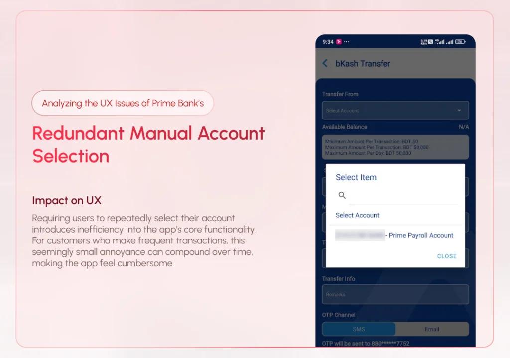
When a user has only one account linked to their profile, the app still requires them to manually select it from a dropdown menu every time they initiate a transfer. This step, though seemingly minor, highlights a lack of attention to detail in the app’s design.
A seamless experience would automatically pre-select the only available account, skipping unnecessary inputs for the user. This type of intelligent automation reflects a modern, user-focused approach to app development, yet MYPrime fails to implement it.
Impact on UX:
Requiring users to repeatedly select their account introduces inefficiency into the app’s core functionality. For customers who make frequent transactions, this seemingly small annoyance can compound over time, making the app feel cumbersome.
3. Confusion in the Beneficiary Management Section
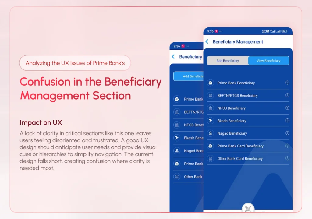
The beneficiary management section in MYPrime is another area where poor design affects usability. Tabs for “Add Beneficiary” and “View Beneficiary” lack clear visual distinctions, often leading users to mistakenly select the wrong option.
Furthermore, the beneficiary list lacks organization, making it difficult for users to differentiate between accounts. For instance, users cannot quickly determine whether a beneficiary is a bank account, a mobile wallet, or another payment channel without additional effort.
Impact on UX:
A lack of clarity in critical sections like this one leaves users feeling disoriented and frustrated. A good UX design should anticipate user needs and provide visual cues or hierarchies to simplify navigation. The current design falls short, creating confusion where clarity is needed most.
4. Inefficient Notification Management
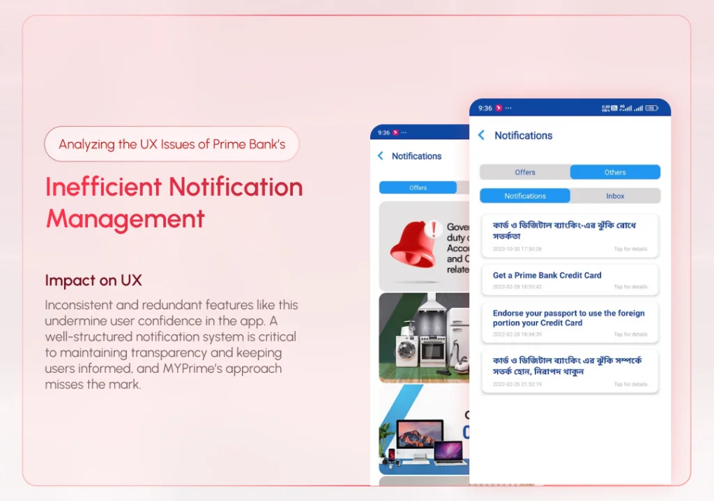
The notification system in MYPrime has multiple tabs, including one labeled “Inbox”, which is currently inactive and serves no purpose. This design choice is puzzling and contributes to an overall sense of clutter in the app.
Users rely on notifications for updates on transactions, offers, and other account-related activities. Having an unused tab not only wastes screen space but also detracts from the overall trustworthiness of the app.
Impact on UX:
Inconsistent and redundant features like this undermine user confidence in the app. A well-structured notification system is critical to maintaining transparency and keeping users informed, and MYPrime’s approach misses the mark.
5. Underdeveloped Profile Section
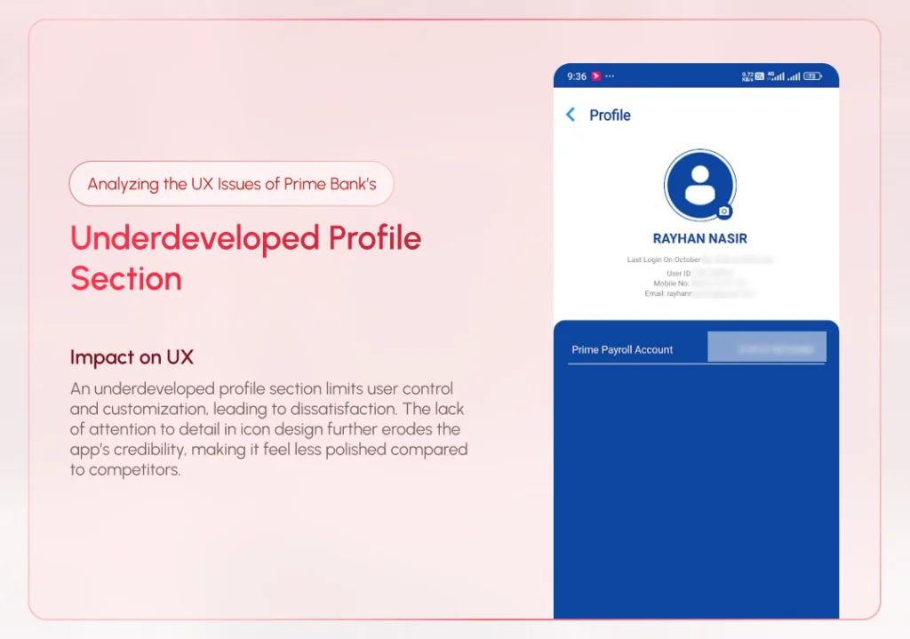
The profile section in MYPrime is shockingly basic, allowing users to change only their profile picture. While this may suffice for a bare-bones app, it falls short for a banking application, where users expect to manage personal details and customize security settings.
Additionally, the app suffers from inconsistent iconography, with mismatched icons scattered across various sections. This inconsistency makes the interface feel unprofessional and poorly thought out.
Impact on UX:
An underdeveloped profile section limits user control and customization, leading to dissatisfaction. The lack of attention to detail in icon design further erodes the app’s credibility, making it feel less polished compared to competitors.
Why These Issues Matter
User experience is more than just aesthetics—it’s about functionality, efficiency, and trust. When a banking app is difficult to use, it not only frustrates customers but also risks losing their loyalty. In today’s competitive market, where fintech startups are raising the bar for usability, Prime Bank cannot afford to lag behind.
Each of the issues discussed above represents a missed opportunity for MYPrime to simplify processes, anticipate user needs, and create a frictionless experience.
How Prime Bank Can Improve MYPrime’s UX
- Introduce One-Time Payment Options: Simplify the money transfer process by allowing users to send funds without adding a beneficiary. This feature is especially crucial for first-time or occasional transactions.
- Automate Account Selection: Pre-select the user’s default account for transfers if only one account is linked, reducing unnecessary manual inputs.
- Redesign the Beneficiary Management Section: Use clear labels, sections, and icons to differentiate between “Add” and “View” tabs. Organize the beneficiary list by channel type, and add search and filter options for better usability.
- Streamline Notifications: Remove inactive tabs like “Inbox” and focus on delivering relevant updates in a clear and concise format. Consolidate notifications into two tabs: “Notifications” and “Offers.”
- Enhance the Profile Section: Add functionality to the profile section, such as editing personal details, managing linked accounts, and updating security preferences like passwords and biometrics. Adopt a consistent icon set across the app to improve its visual appeal.
- Offer a Feedback Mechanism: Allow users to report issues or suggest improvements directly through the app. A feedback loop ensures that Prime Bank can proactively address customer pain points.
- Introduce Dark Mode and Faster Performance: Adding features like dark mode and optimizing app performance (e.g., reducing loading times) can further elevate the user experience.
Conclusion
The MYPrime app has the potential to become a flagship tool for Prime Bank, but its current state leaves much to be desired in terms of user experience. By addressing usability issues such as redundant steps, poor navigation, and limited functionality, Prime Bank can transform MYPrime into a truly modern and user-friendly application.
With user expectations continuously evolving, banks must prioritize UX as much as security and functionality. By focusing on user needs and implementing the suggestions outlined above, Prime Bank can ensure its app not only retains its existing customers but also attracts new ones looking for a seamless banking experience.
Related Portfolios

The Importance of Visibility of System Status and Microinteractions: A Real-Life Example
Have you ever clicked a button

Why UX-Driven Companies Prefer Rounded Buttons
In late 2023, I took on