Product Case Study
Beebook Website
A UX Case Study on Storytelling & Conversion in Beebook’s SaaS Website
Company
Pridesysit Ltd.
Industry
FinTech Website
Timeline
2025 (2 Week)
My Role
UX/UI Designer
About the Project
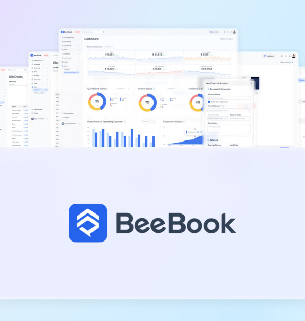
About Beebook
The Beebook Website is the primary marketing and conversion platform for Beebook—an AI-powered accounting module within a cloud-based ERP ecosystem. The website’s role is to clearly communicate product value, build trust, and guide different user groups toward purchasing or requesting a demo.
My responsibility was to lead the UX strategy, content structure, UX copy, wireframing, UI design, and interaction planning, ensuring the website reflected a modern SaaS experience while addressing the real decision-making needs of potential customers.
Why?
The Problem
Beebook was entering a competitive SaaS market where most accounting websites:
- Overload users with feature lists
- Fail to explain value clearly for different roles
- Use outdated layouts that reduce trust
- Do not guide users through a clear decision journey
The challenge was not just to design a visually modern website—but to create a content-driven, research-backed experience that helps users quickly understand:
• Is this product for me?
• How does it solve my problem?
• Why should I trust it over others?
How?
The Process
1
Direct Competitor Website Research
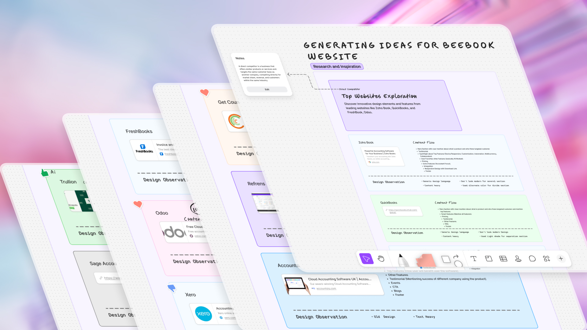
I started with direct competitor website exploration, focusing on established accounting and ERP products. The goal was to understand how competitors structure their homepage content, what messaging they prioritize, and where users might feel confused or overwhelmed.
Key Findings
- Most websites were feature-heavy and value-light
- Content was written for accountants, not decision-makers
- Weak storytelling and poor flow between sections
- Limited use of microcopy to reduce cognitive load
2
Content Flow Analysis
After analyzing competitor sites, I mapped their content flow patterns, such as: Hero → Feature dump → Pricing → Footer. This helped identify what to avoid and where Beebook could differentiate through clarity and narrative.
3
Design Observations & UX Gaps
From my observations:
- Visual hierarchy was often unclear
- CTAs lacked context or motivation
- Too much technical language upfront
- Minimal emotional reassurance (security, trust, compliance)
These insights shaped Beebook’s website strategy—educate first, sell second.
4
Modern SaaS Website Exploration
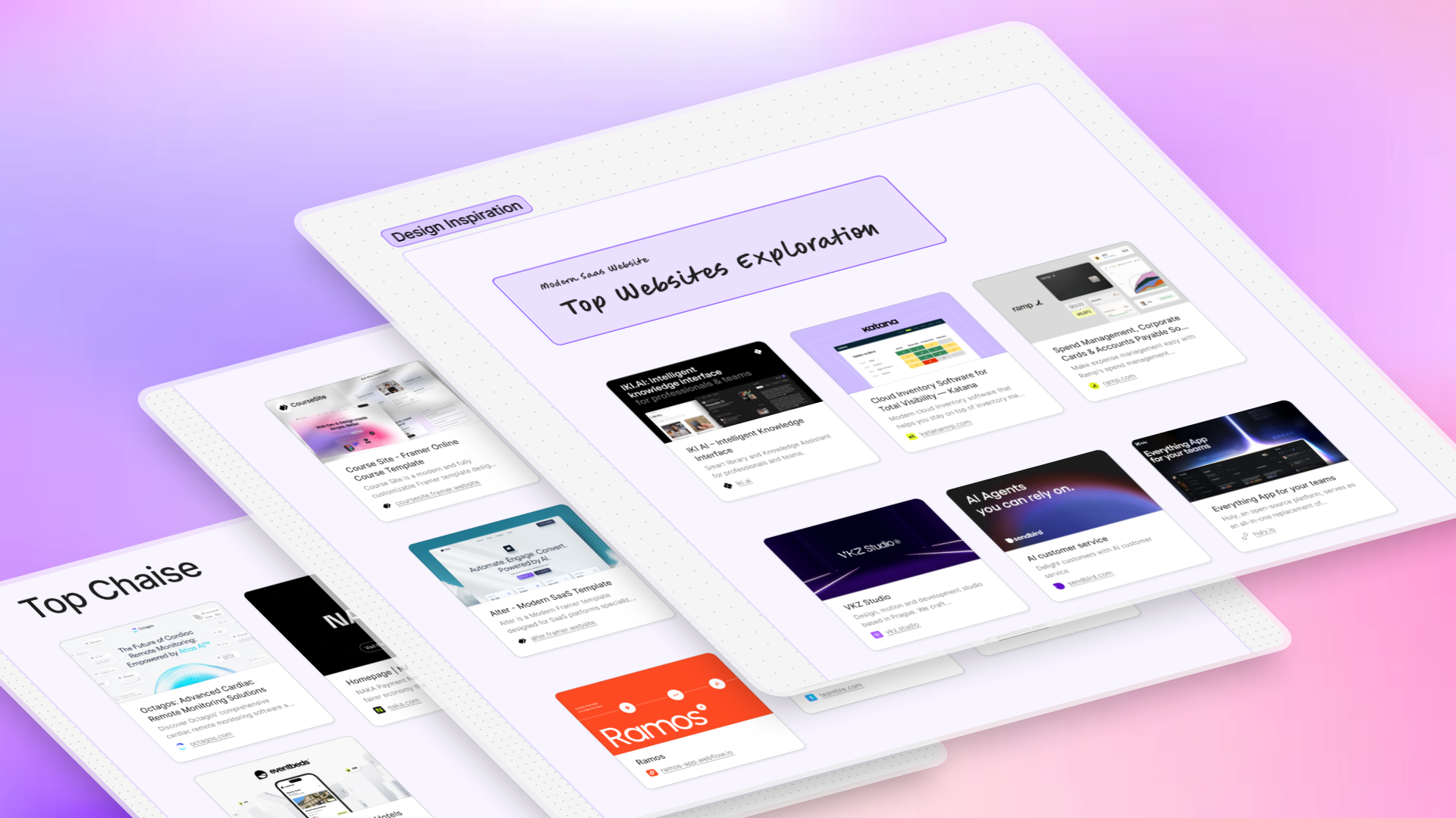
To elevate the visual and interaction quality, I explored modern SaaS and fintech websites outside the accounting space. The focus was on clean layouts and strong spacing, clear value propositions, modular content blocks, and motion used with purpose, not decoration. This exploration helped define the modern SaaS direction for Beebook’s website.
5
User Profile Creation
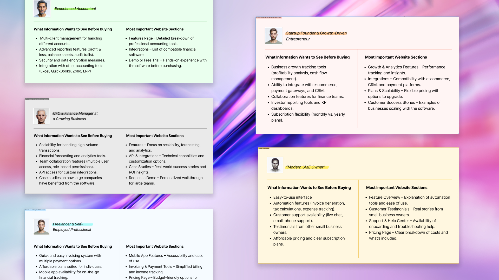
Next, I created user profiles representing all key Beebook audiences and identified what each user wants to see before purchasing.
SME Owners
Business value, simplicity, pricing clarity
Accountants
Accuracy, compliance, feature depth
CFOs & Finance Managers
Control, reporting, scalability
Startup Founders
Speed, automation, integrations
Freelancers
Ease of use, affordability
Each group had different content priorities, which directly influenced content placement and messaging.
6
Merging User Needs into Website Content Flow
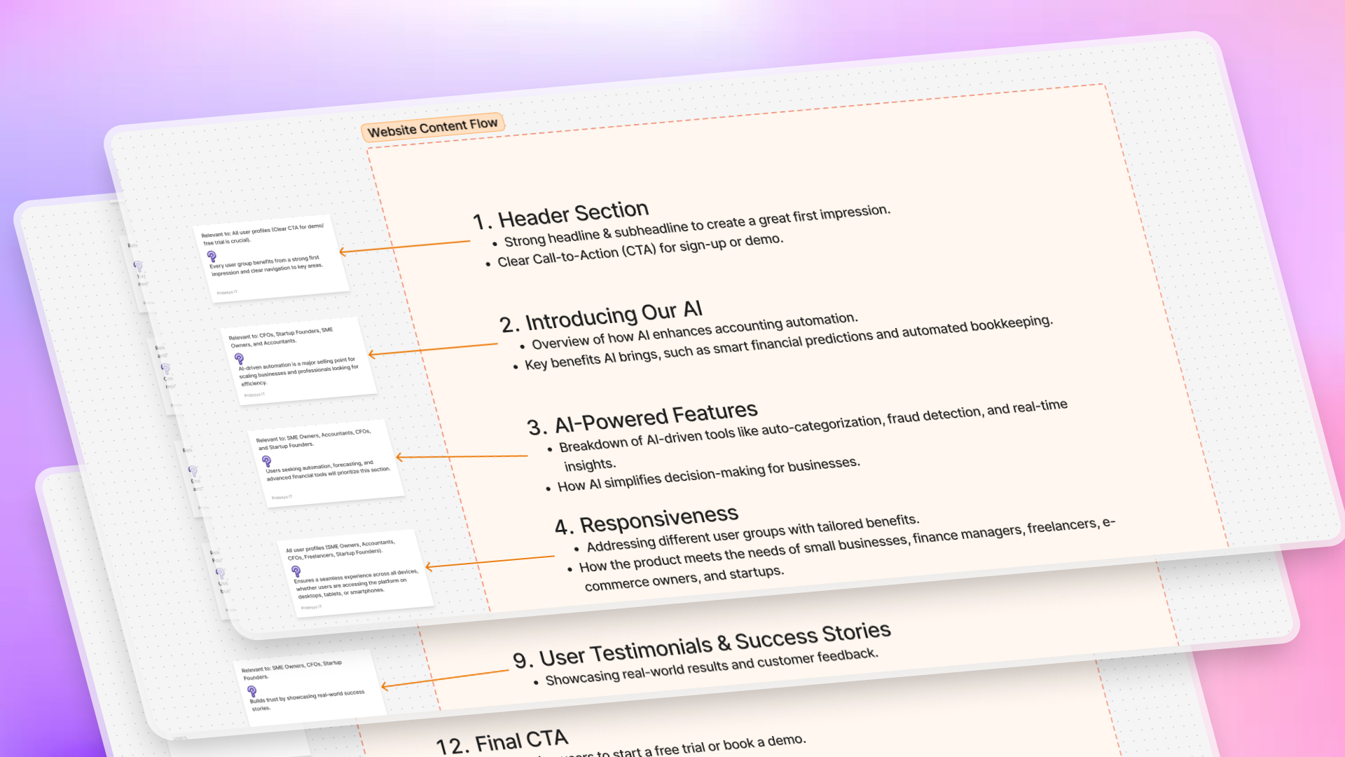
I merged all user profiles into a single, flexible website content flow that:
- Addresses high-level value first
- Gradually introduces features
- Allows users to self-select deeper content
- Reinforces trust at every stage of the journey
This ensured the website worked for multiple personas without fragmenting the experience.
7
UX Copywriting
With the content structure finalized, I focused on UX copy:
Simple, jargon-free language
Clear section-level messaging
Microcopy to guide user actions
Benefit-driven headlines
Ease of use, affordability
The goal was to reduce friction and help users quickly understand why Beebook matters to them.
8
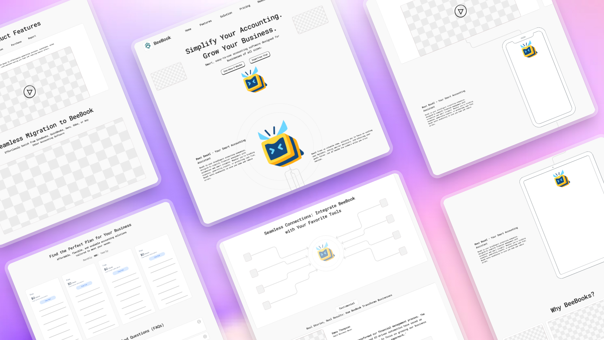
Storytelling Approach
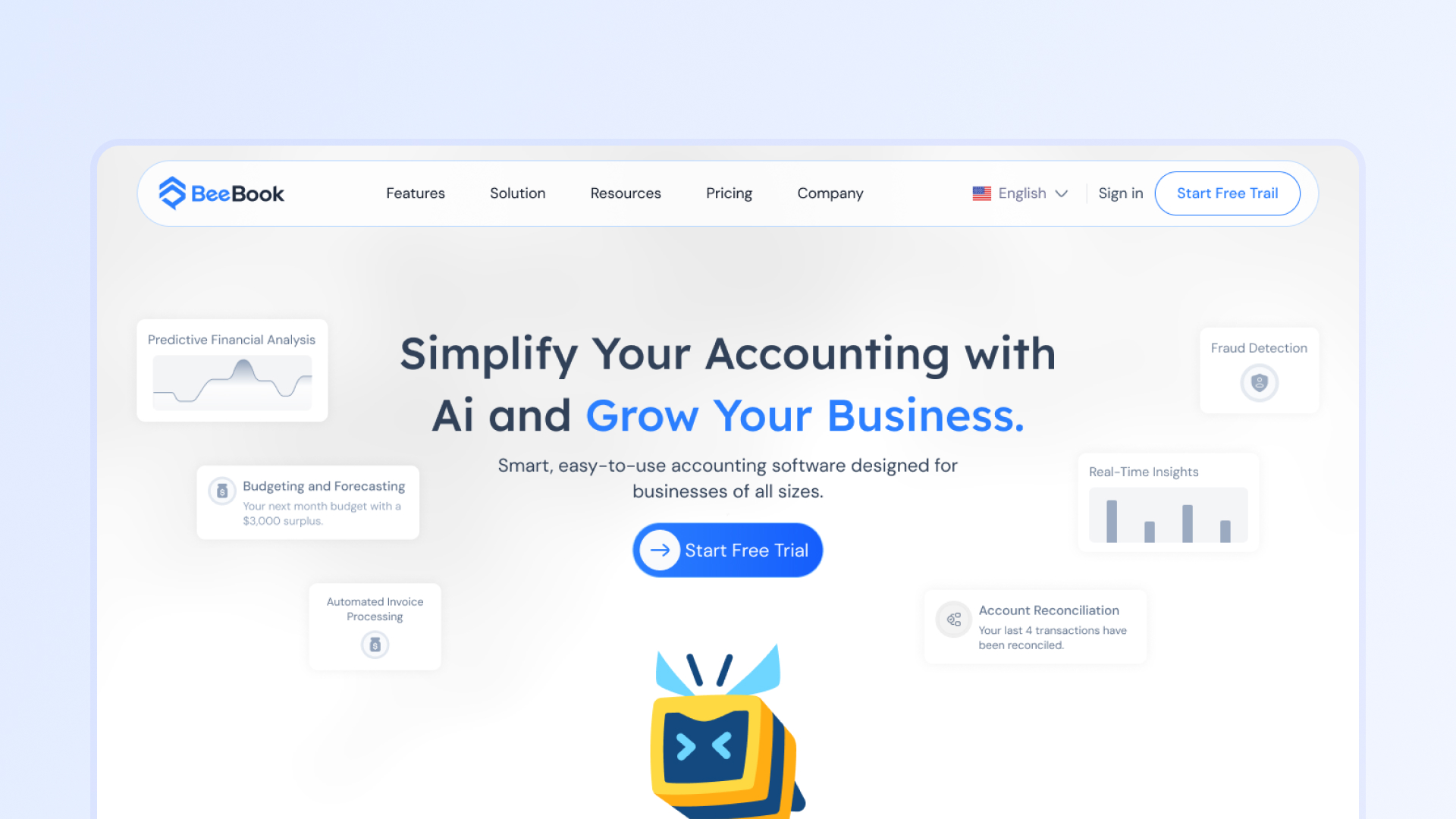
The Beebook website follows a guided storytelling approach led by the Beebook mascot, which represents the product’s AI intelligence. The goal of this approach is to make a complex accounting solution feel approachable, understandable, and engaging—especially for first-time visitors.
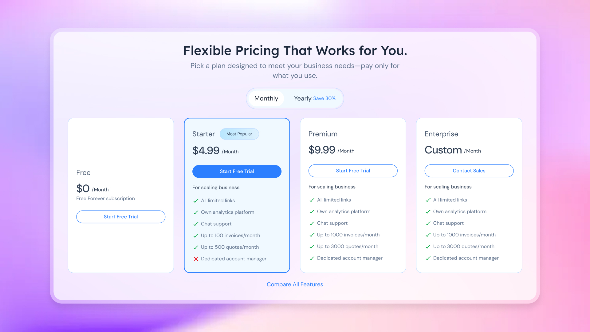
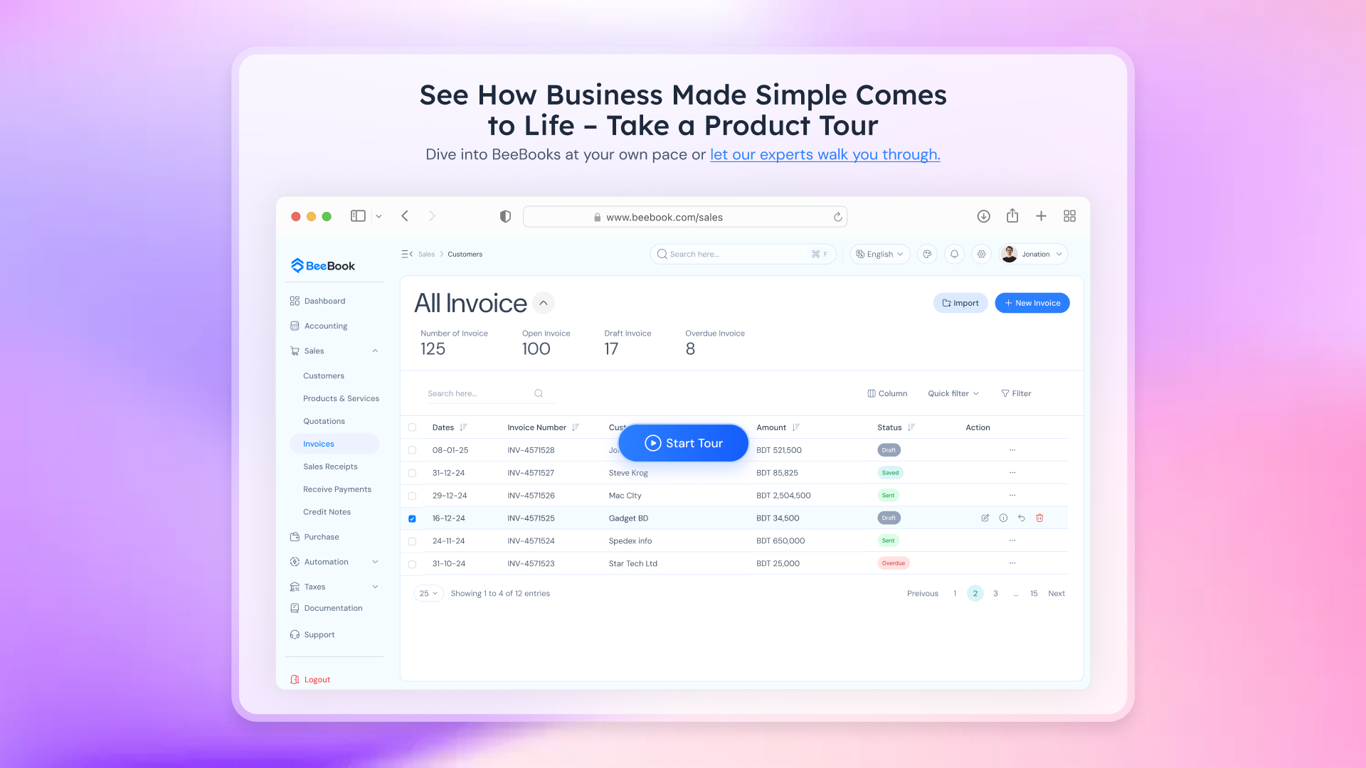
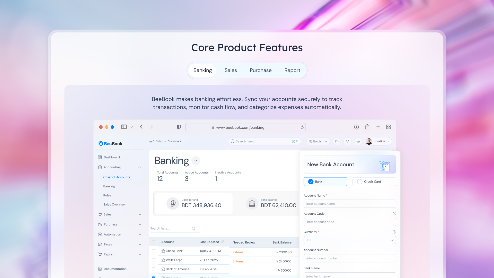
Hero Section: First-Glance Clarity
The hero section is designed to immediately answer: ‘What is Beebook, and why should I care?’ A concise value-driven headline explains Beebook’s purpose at first glance, supporting visual cards highlight key benefits, and the mascot appears subtly, drawing attention and signaling the start of a guided journey.
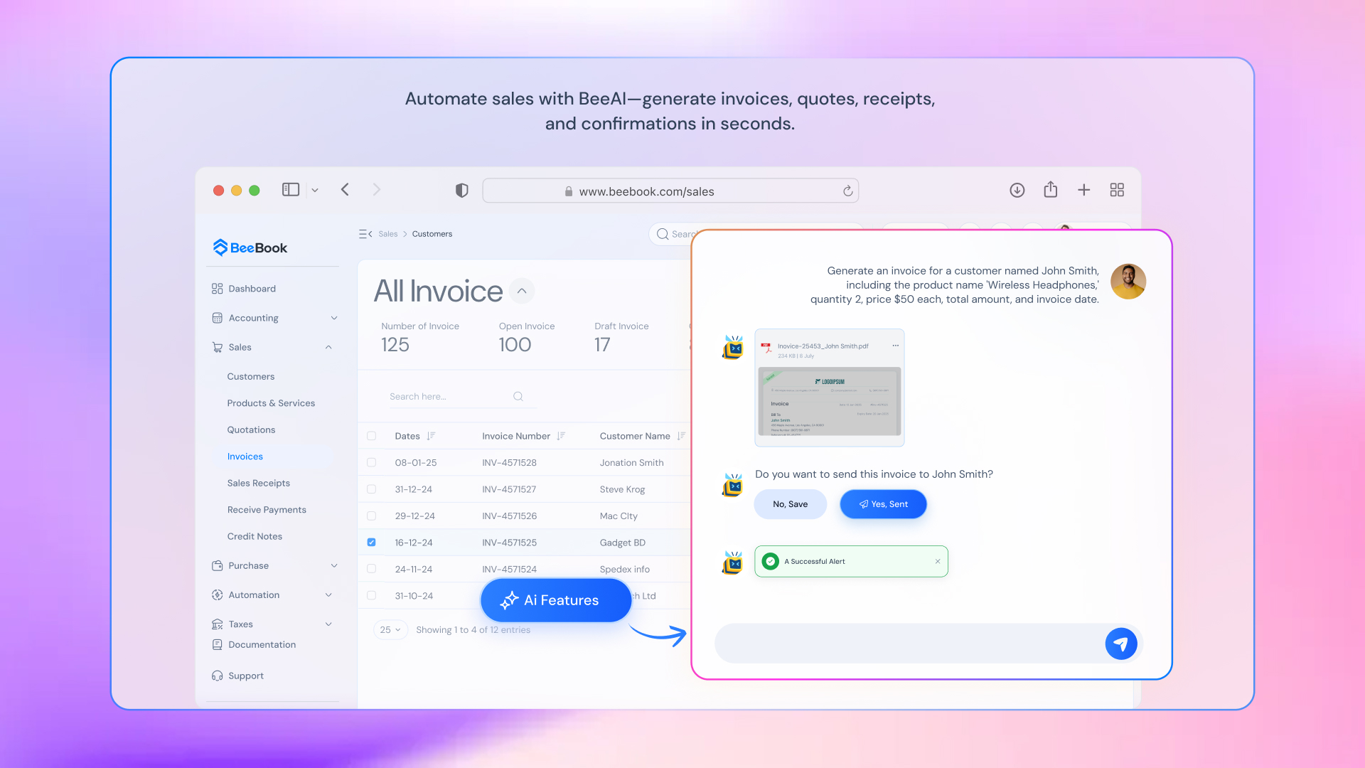
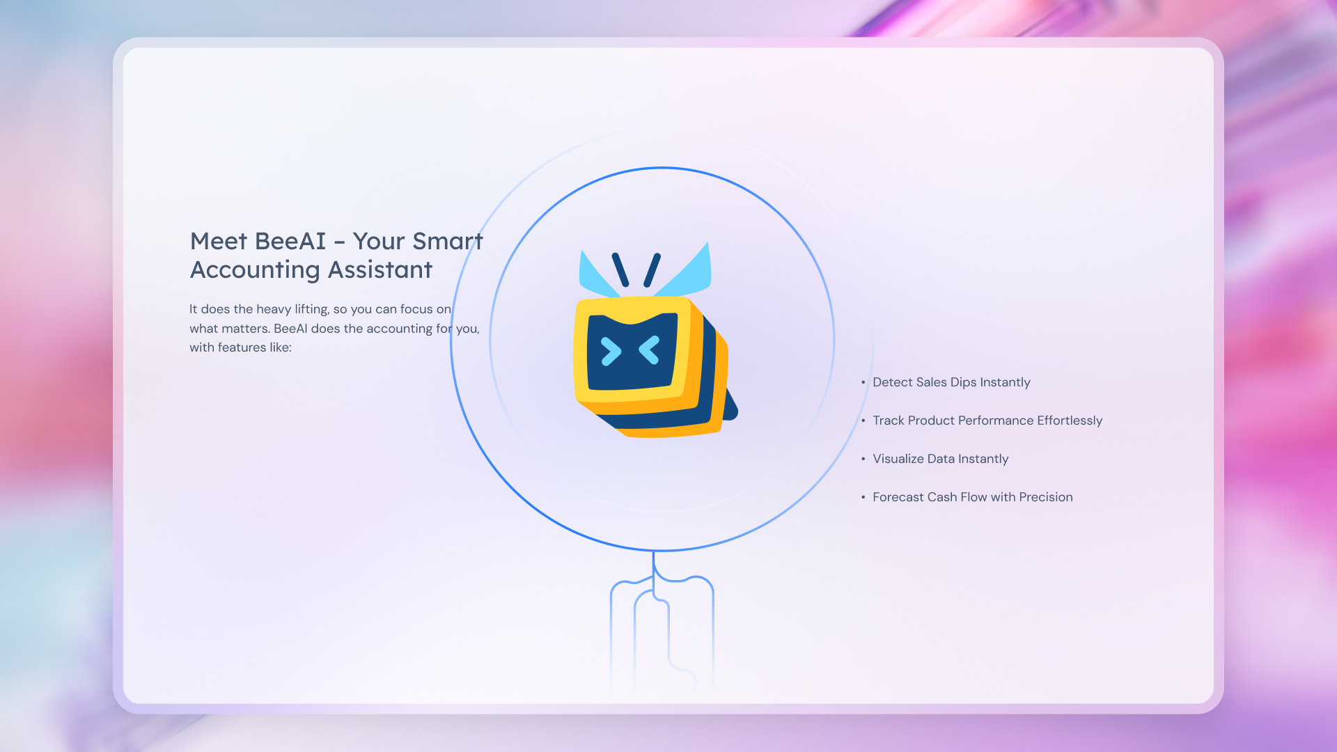
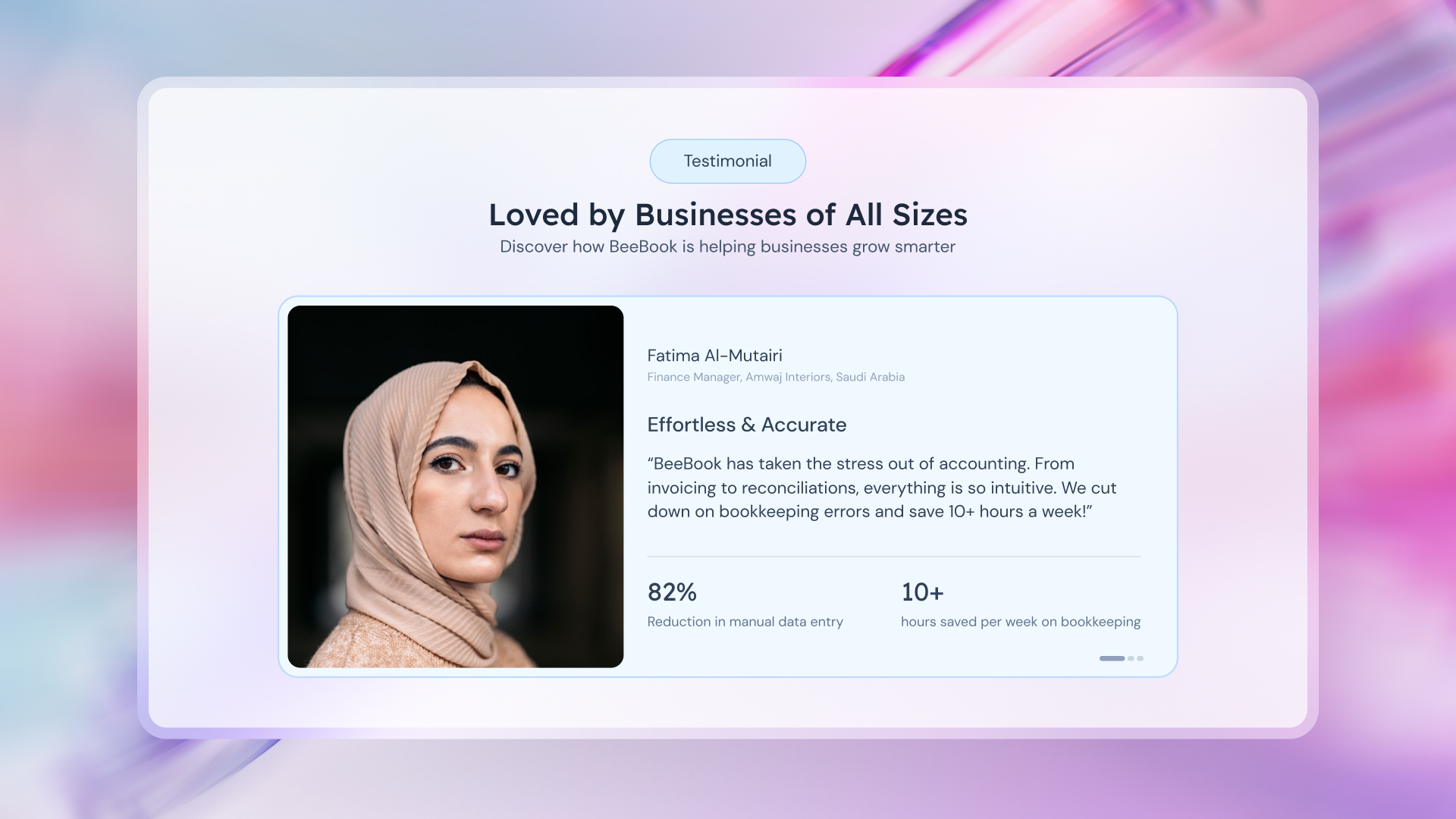
Guided Introduction Through the Mascot
As users scroll, the mascot reappears and introduces itself—positioning Beebook’s AI as a friendly, supportive guide rather than a complex system. Through this interaction, the mascot explains what users can do with Beebook, highlights the benefits of AI-powered automation, and reduces anxiety around accounting by using simple, human-centered language.
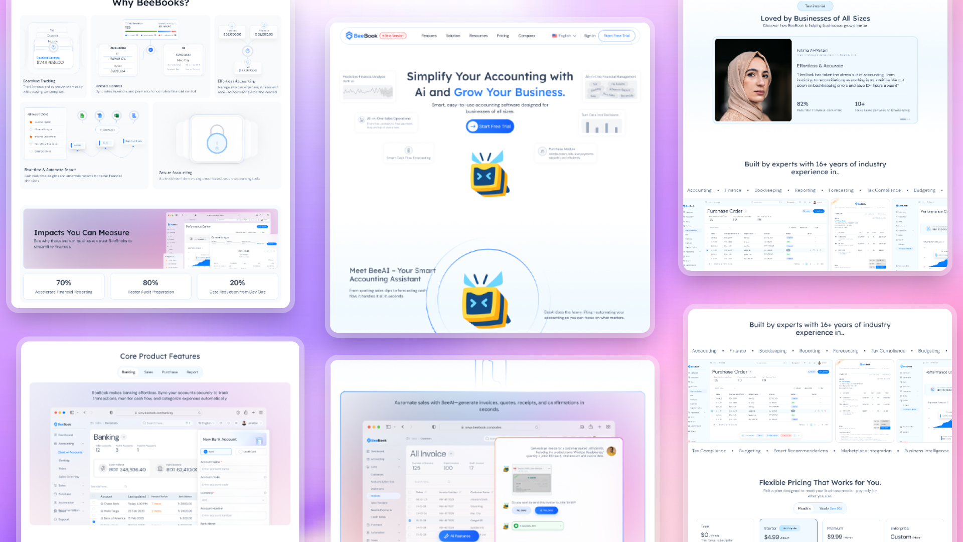
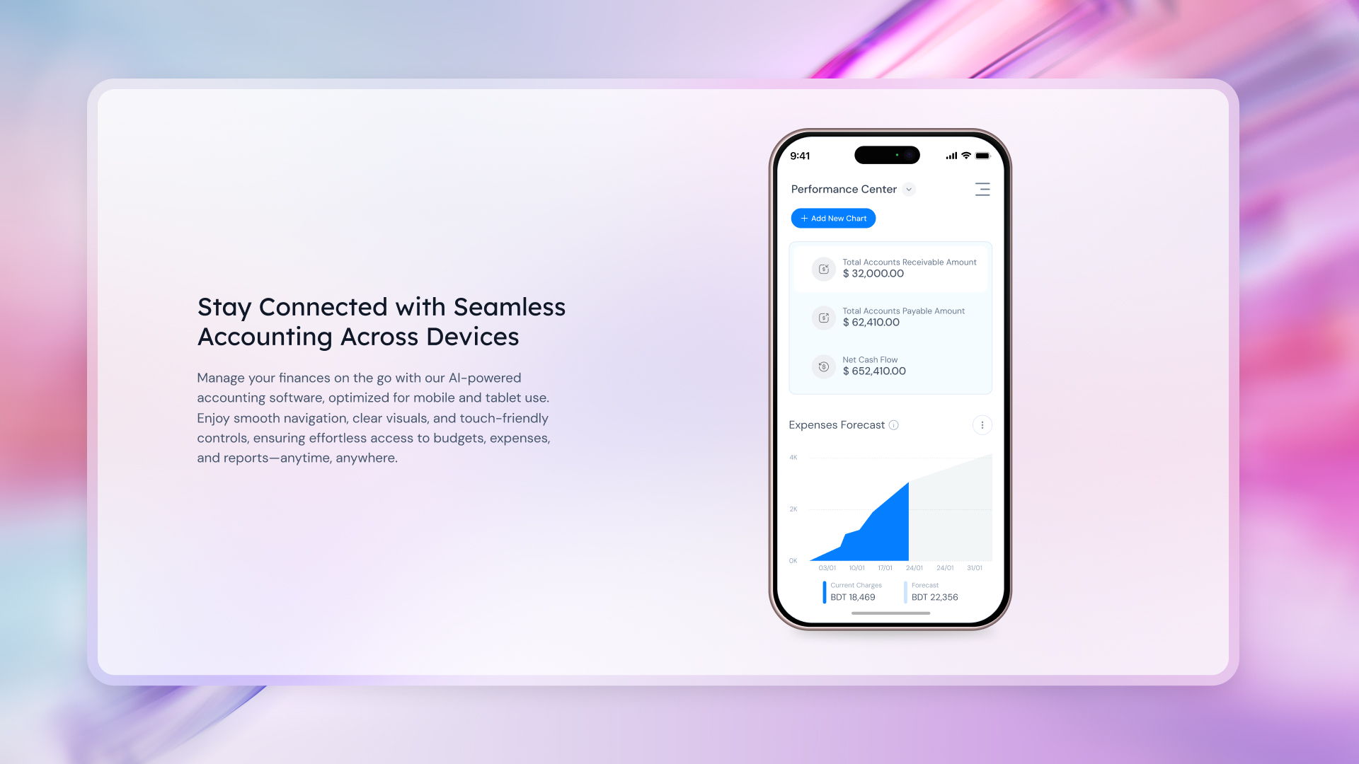
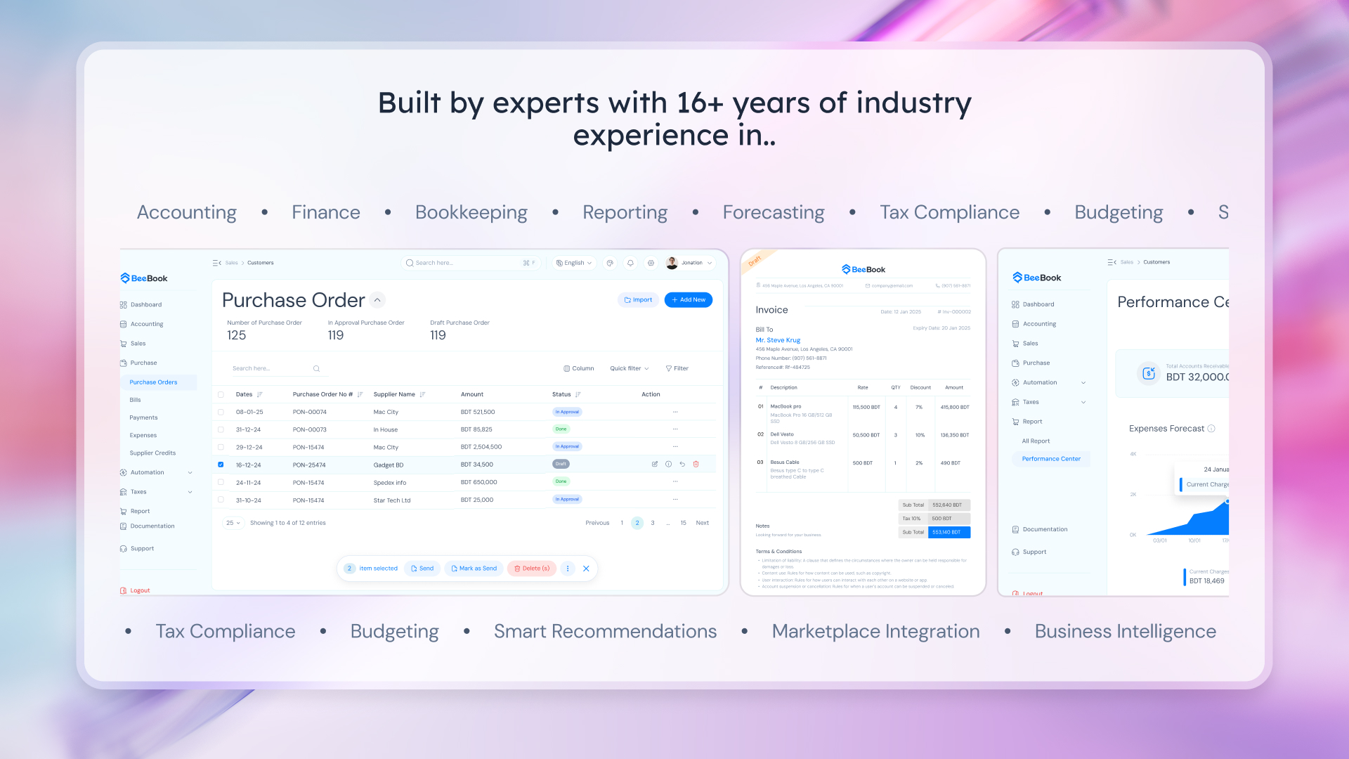
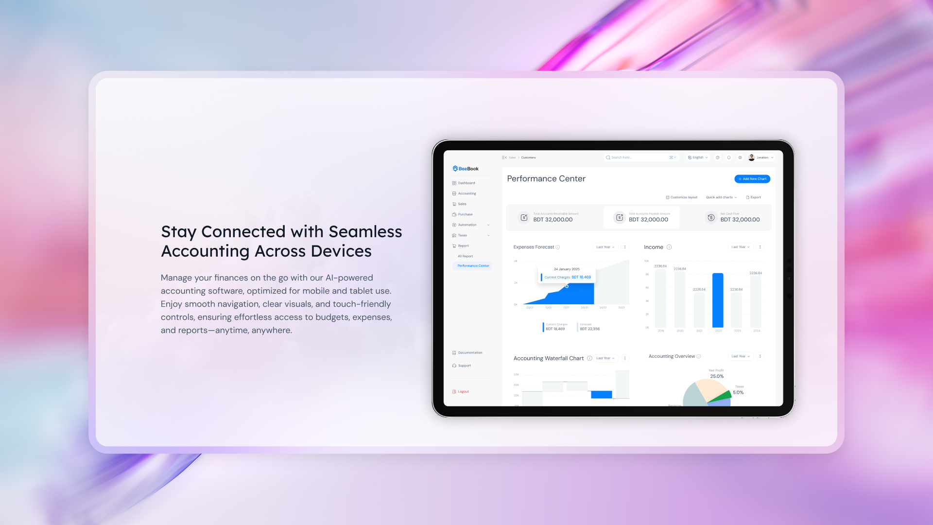
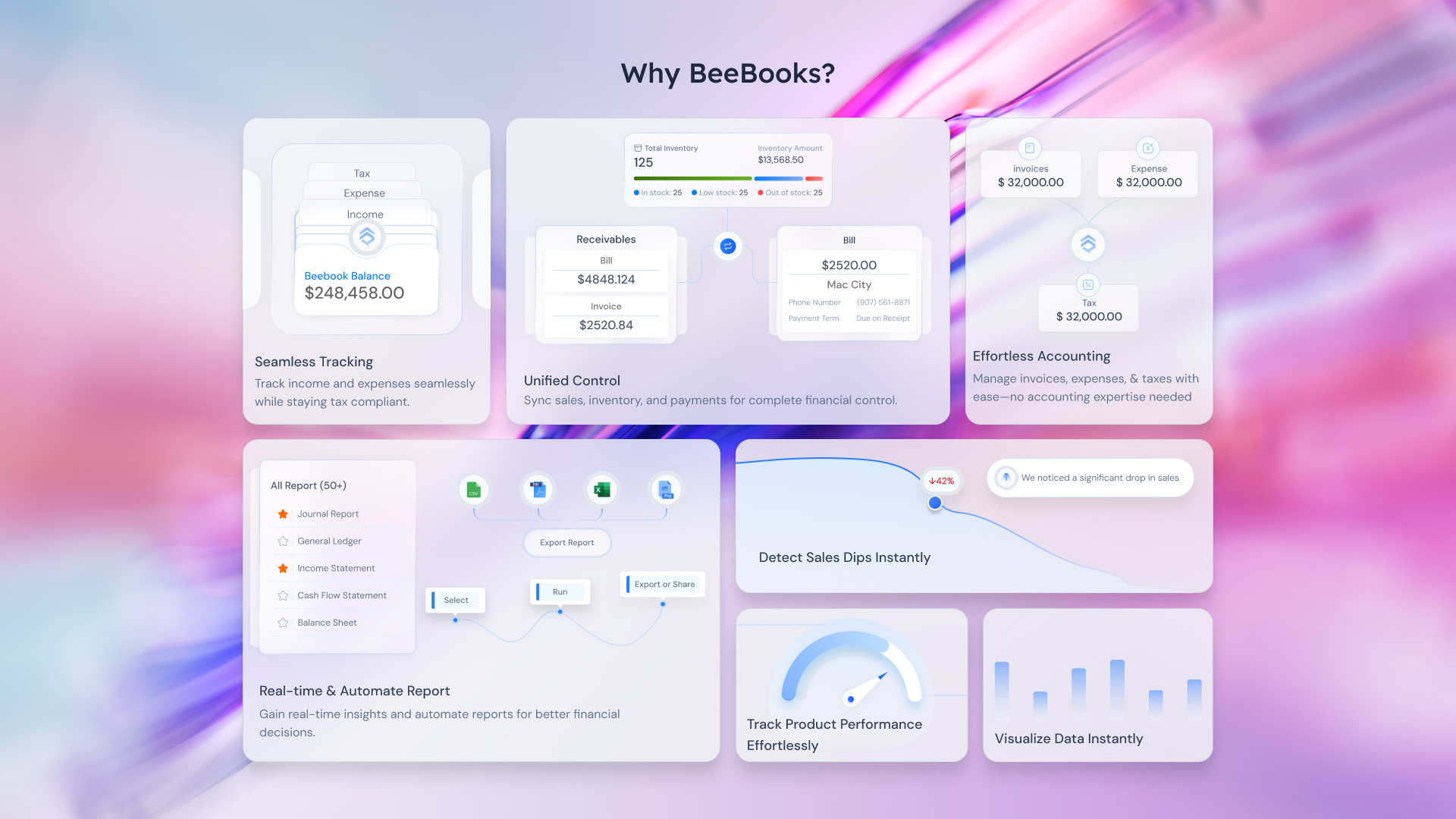
Feature & Responsiveness Introduction
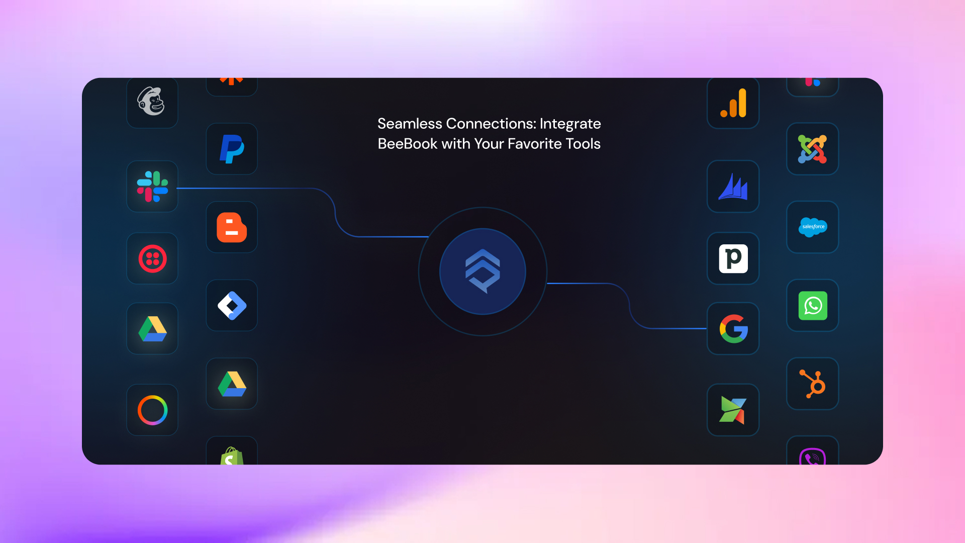
Using the mascot as a storytelling anchor, core features are introduced contextually rather than as a flat list. Device responsiveness is showcased naturally within the flow, and each feature is tied to a real user benefit, not just functionality.
Transition to Independent Exploration
After introducing the key AI features and value propositions, the mascot gradually steps back. At this stage, users are familiar with the product and its benefits, allowing them to explore advanced features, pricing, and technical details independently.
This storytelling-driven approach transforms Beebook’s website from a static marketing page into a guided product experience, making complex financial software easier to understand, more memorable, and more engaging.
9
Wireframing
Low- to mid-fidelity wireframes were created to validate content hierarchy, test section transitions, ensure CTAs appeared at the right moments, and align layout with user decision-making behavior.
10
Stakeholder Collaboration & Feedback
I shared the research insights and wireframes with stakeholders and the product team. Feedback was gathered on:
- Business alignment
- Messaging clarity
- Feature prioritization
Based on discussions, the design was refined and finalized.
11
UI Design & Interaction
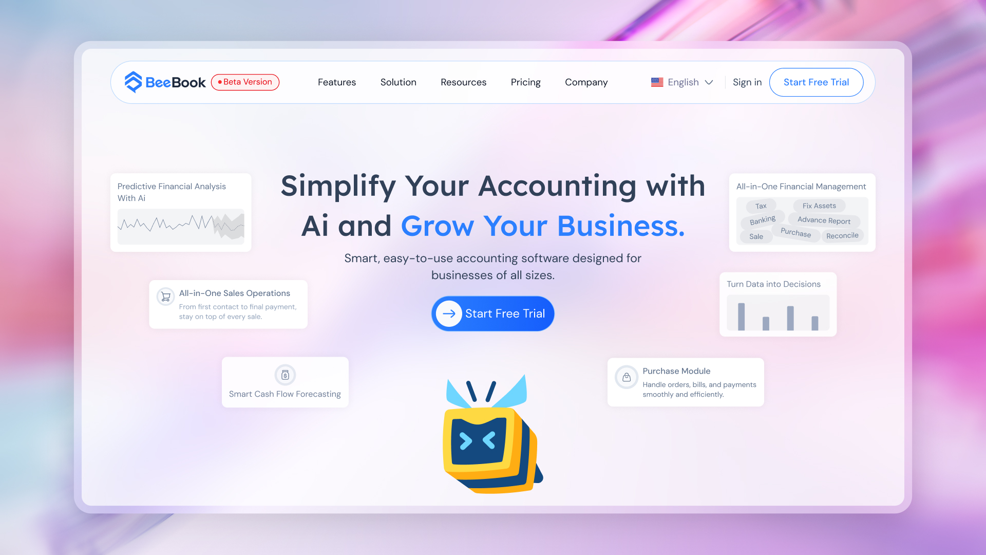
Once approved, I moved into high-fidelity UI design, applying modern SaaS visual principles, maintaining brand consistency with Beebook’s product UI, and designing responsive layouts for scalability.
12
Motion & Interaction Simulation
After completing the UI, I added animations and interactions to simulate:
- Page transitions
- Section reveals
- Hover and scroll behavior
- How motion supports understanding and flow
Animations were intentionally subtle and functional—enhancing clarity rather than distracting users.
Outcome
Results & Impact
✓ Created a research-driven, conversion-focused SaaS website
✓ Aligned marketing, product, and UX under a single narrative
✓ Improved clarity for multiple user personas
✓ Delivered a modern, trustworthy, and scalable web experience for Beebook

Related Portfolios
From Paper to Product: Designing a Script Tool That Acquired 100 Users in 30 Days
Product Case Study Script Memory From
A UX Research-Driven Design of an AI Accounting Platform
Product Case Study Beebook A UX

Solving a Real-Life UX Challenge: Making My Balcony Safe for My Daughter
UX Case Study Solving a Real-Life