
Social Mate is a social networking mobile application. In this UX case study, I walk through how I designed it end to end: from stakeholder and user interviews, to personas and journey maps, to information architecture, wireframes and a complete UI kit.

Project Timeline and Team
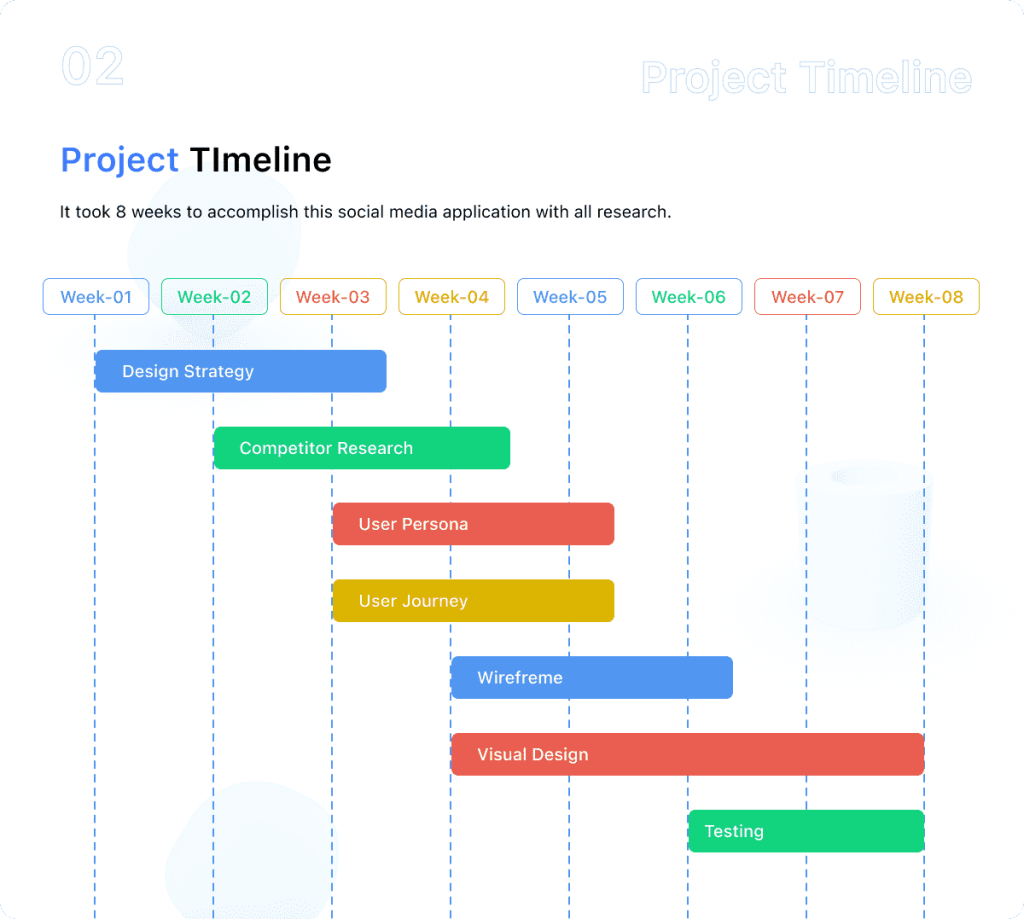
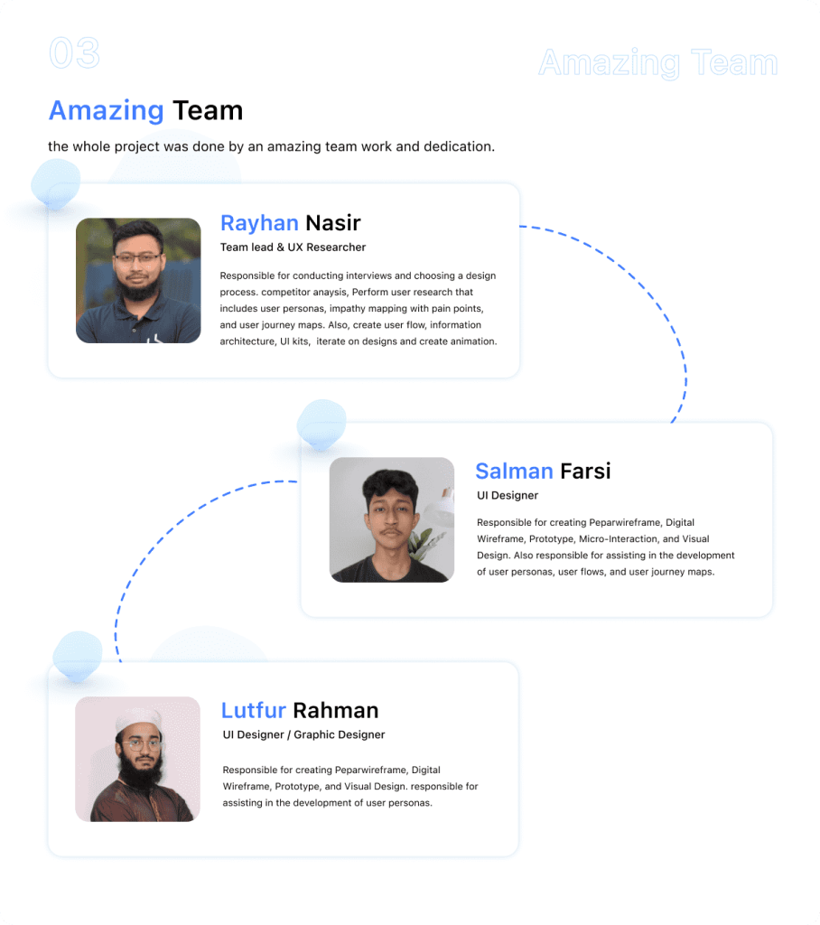
The project followed a planned timeline so that research, definition and design each had dedicated time. The images below show the schedule and the team behind the work.
Design Process
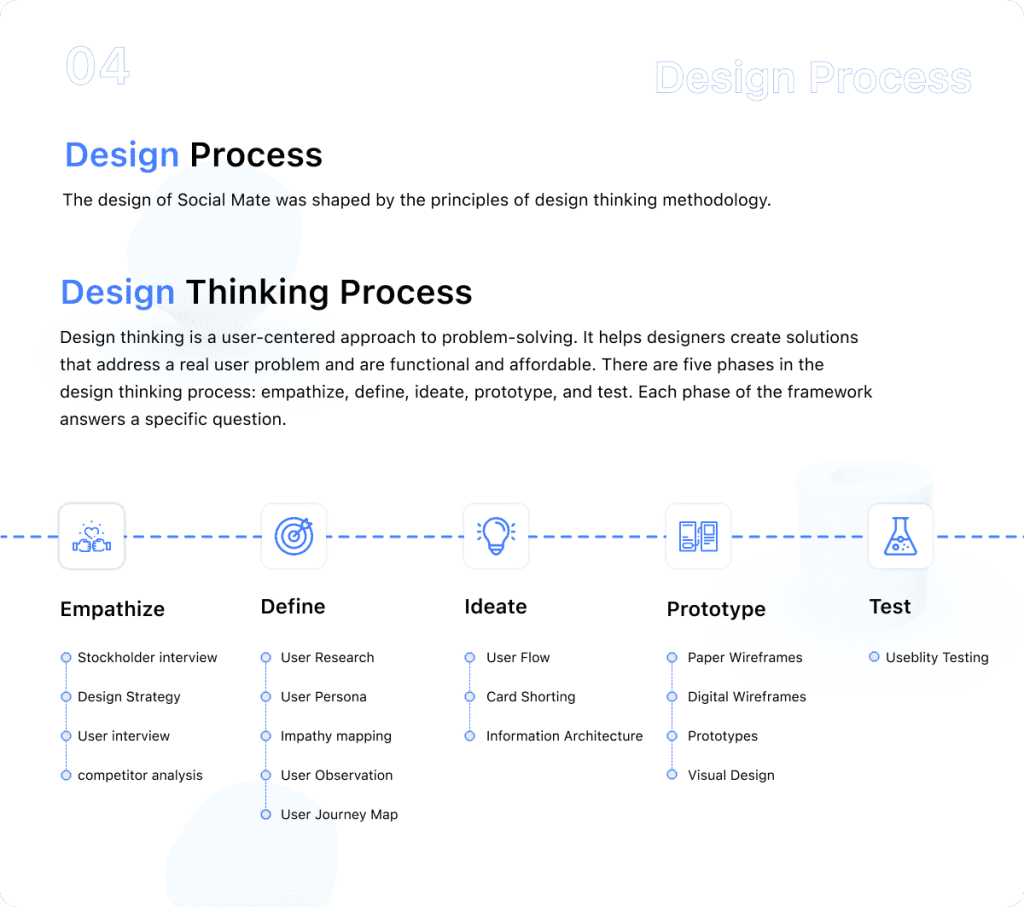
I used a user-centered design process that moved from research, to defining the problem, to structuring the app, to the final interface. Each stage below builds on what the one before it uncovered.
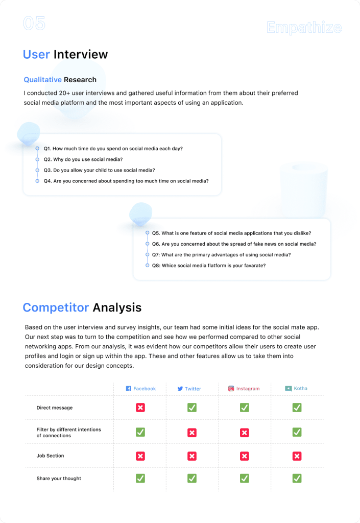
Research: Stakeholder and User Interviews
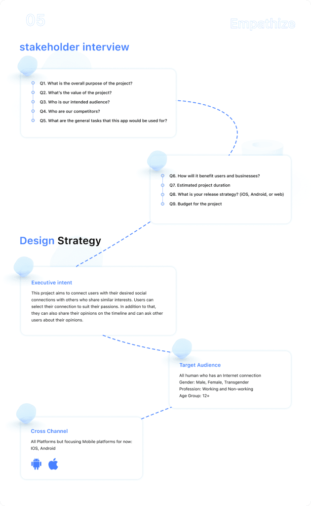
I started by interviewing stakeholders to understand the business goals and constraints behind Social Mate. I then interviewed potential users to learn how they use social networks today, what frustrates them, and what would make a new platform worth joining.
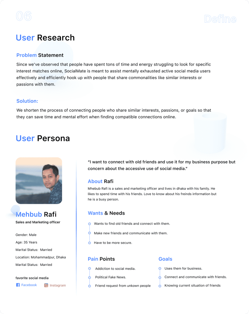
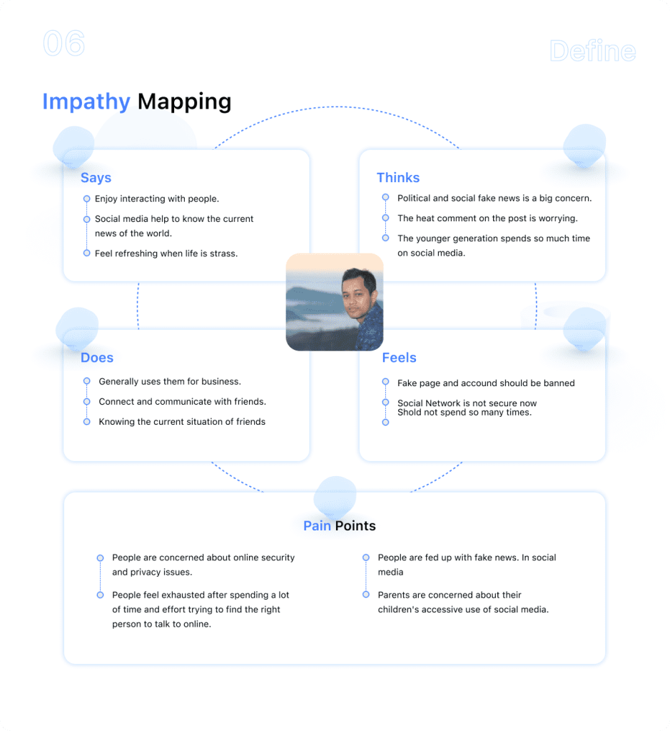
User Persona and Empathy Map
The interview insights were combined into a user persona: a realistic profile of the people Social Mate is designed for. The empathy map captures what that user says, thinks, does and feels, which kept design decisions grounded in real needs rather than assumptions.
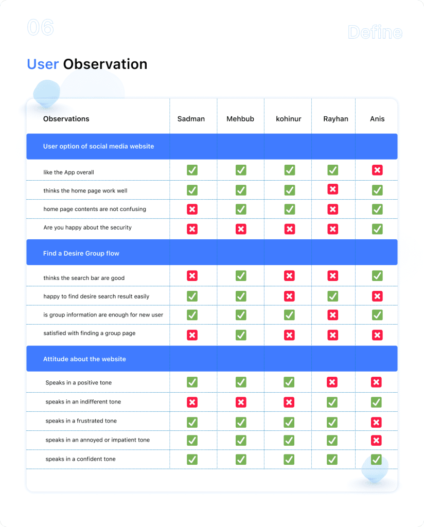
User Observation
Observing people as they used social apps revealed behavior that interviews alone can miss, such as workarounds, moments of hesitation, and the features people actually rely on day to day.
User Journey Map and User Flow
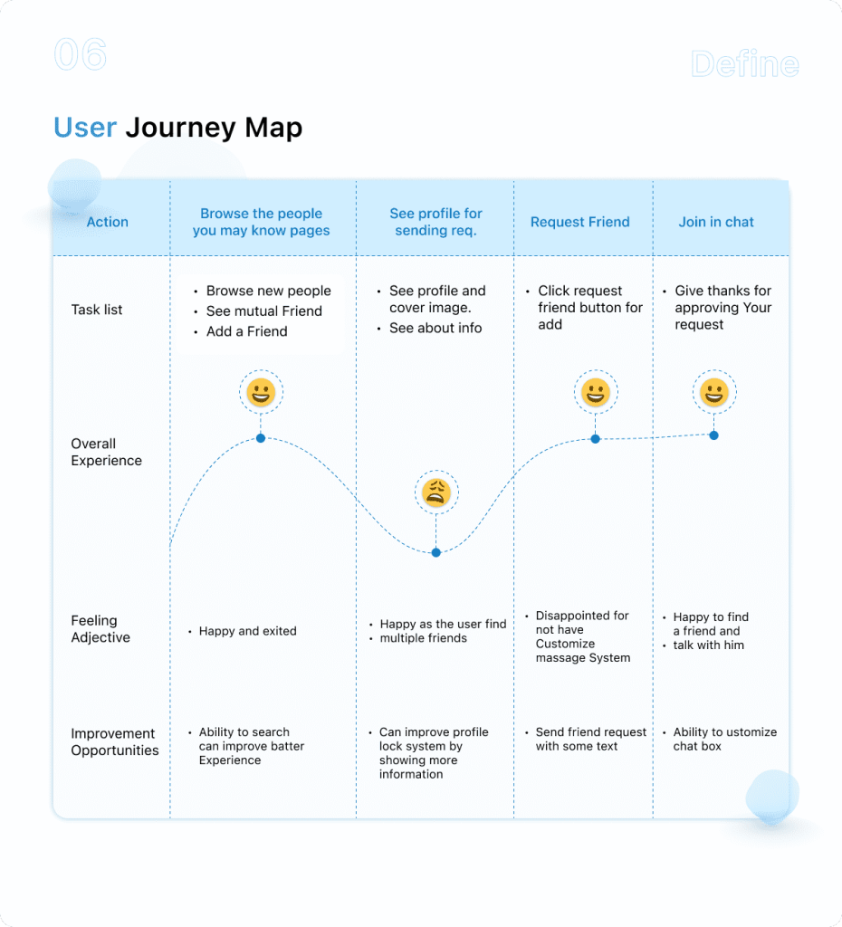
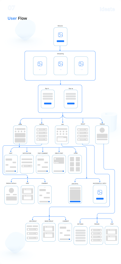
The user journey map traces each step a user takes with Social Mate, along with their goals and pain points at every stage. From there, the user flow maps the exact paths through the app, so every screen has a clear purpose.
Card Sorting and Information Architecture
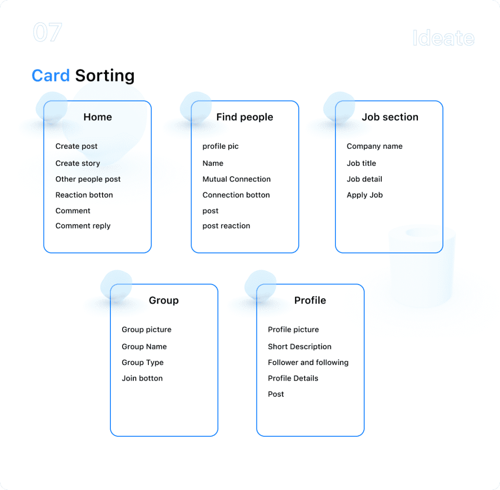
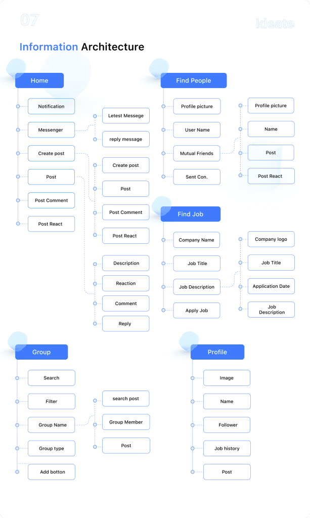
Card sorting showed how users naturally group the app’s content and features. Those results shaped the information architecture, the structure behind Social Mate’s navigation and screens.
Paper and Digital Wireframes
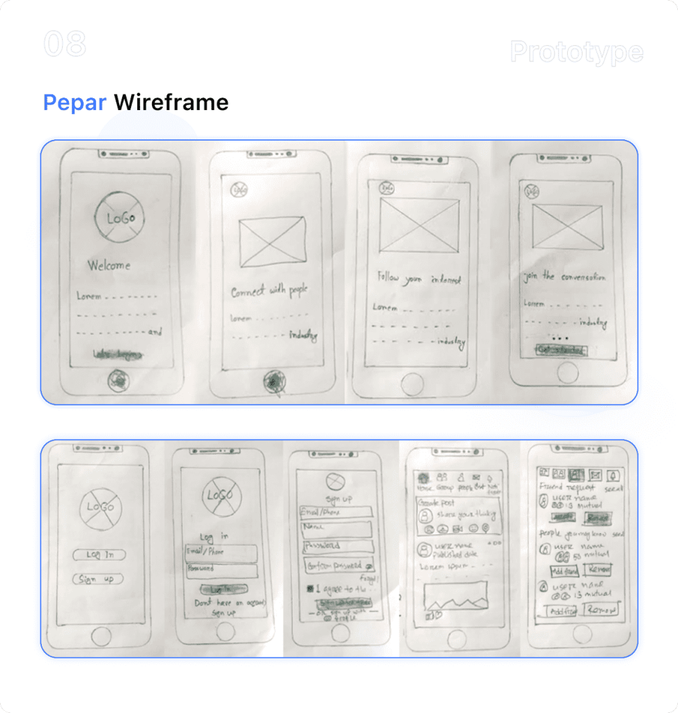
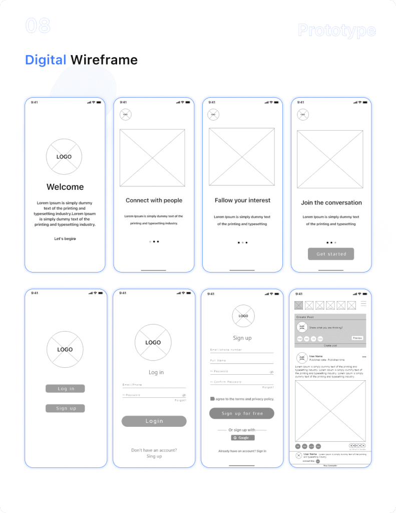
I sketched paper wireframes first to explore layouts quickly, then turned the strongest ideas into digital wireframes to set structure and hierarchy before any visual design.
Text Styles, UI Kit and Components
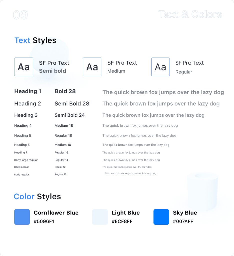
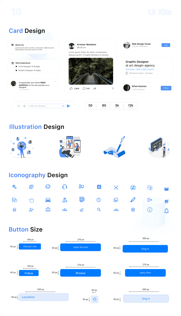
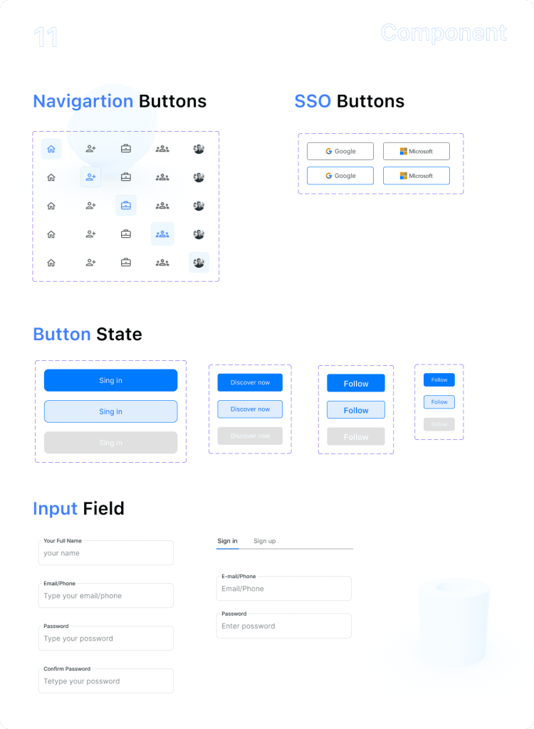
Next came a consistent visual system: text styles, a UI kit and reusable components. Defining these up front kept every screen consistent and made the final design faster to build.
Final UI Design
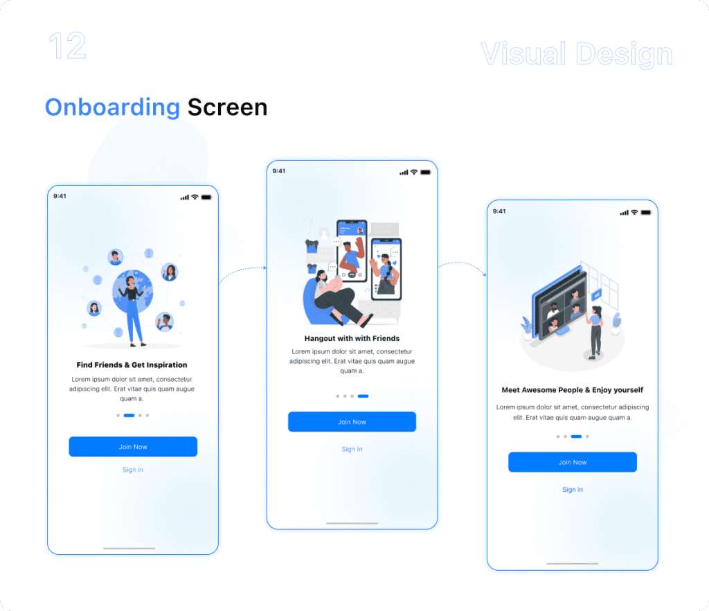
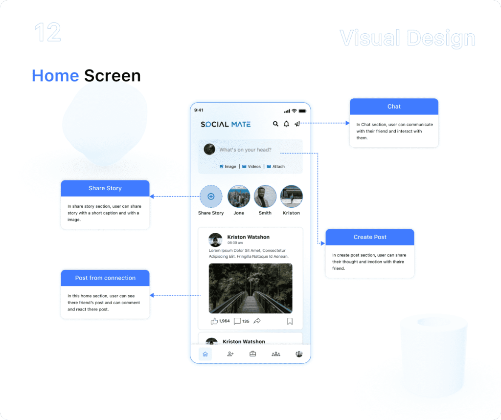
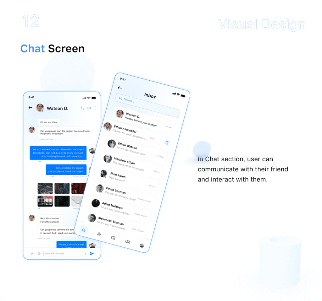
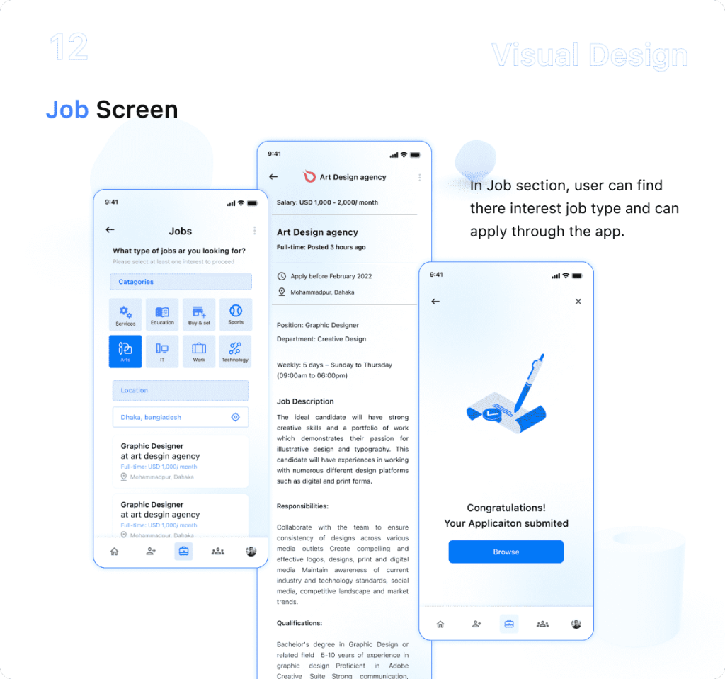
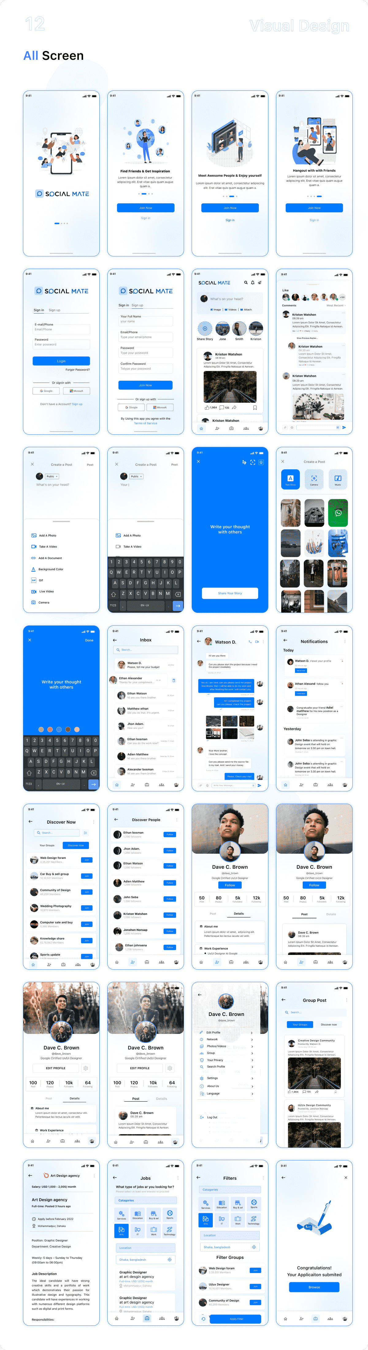
The final screens bring it all together: onboarding for new users, the home feed, chat, and a jobs section. Each screen follows the user flow and is built from the component library defined earlier.
Related Portfolios
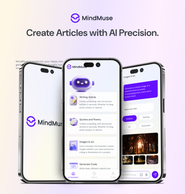
Mind Muse Mobile Application UI Design
Initial Idea Initially, my plan was
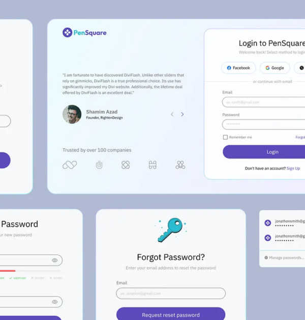
Sign-In Process Screens – Secure & User-Friendly Access Flow
Presenting the Sign-In Process for a secure and
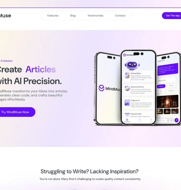
MindMuse Web Landing Page Design
Excited to share the MindMuse web page design!