Product Case Study
Beebook
A UX Research-Driven Design of an AI Accounting Platform
Company
Pridesysit Ltd.
Industry
ERP & Accounting Software
Timeline
2024-2025 (7 Months)
My Role
UX/UI Designer
What?
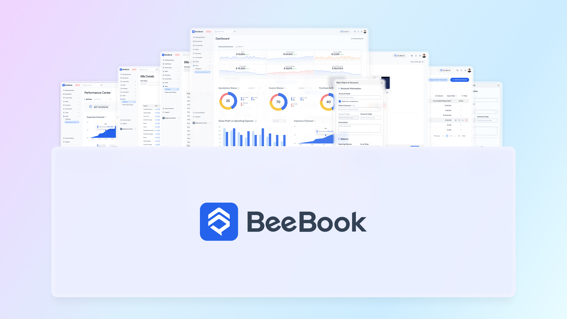
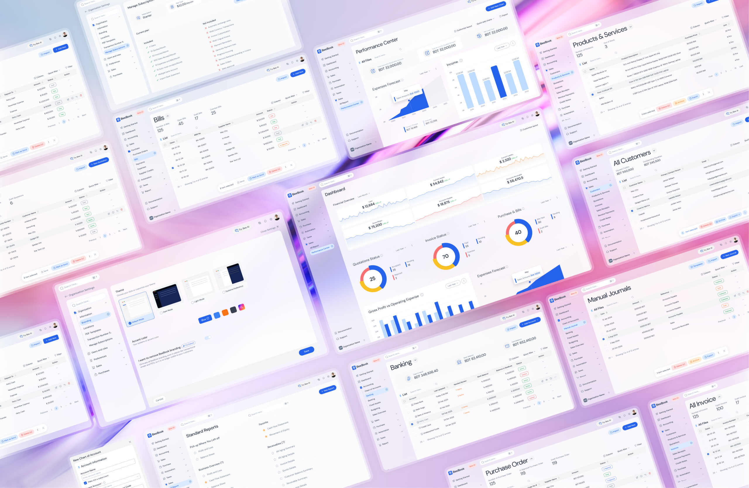
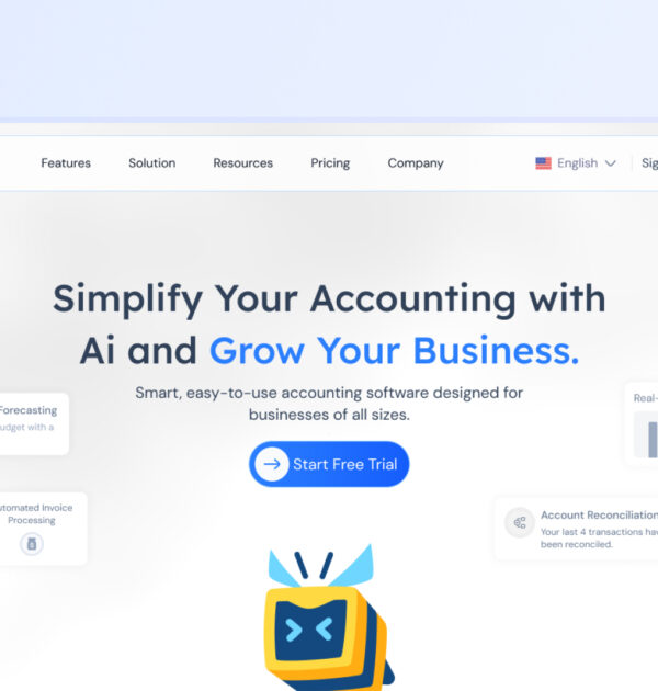
About Beebook
Beebook is an AI-enabled accounting module within a cloud-based ERP platform. It is designed to simplify financial management for businesses by combining a modern design language with intelligent automation—allowing teams to spend less time on accounting tasks and more time growing their business.
My role was to translate complex business and accounting requirements into a highly usable, scalable, and modern product experience. I led the UX and UI design, established the design language, and built a design system that could be adopted across all ERP modules to ensure long-term scalability and consistency.
Key Impacts
30%
Reduced task completion time by simplifying multi-step accounting workflows
25%
Improved subscription activation through streamlined billing and plan selection
40%
Increased settings discoverability via improved IA and micro-interactions
60%
Reduced permission-related errors by redesigning role and access control flows
Why?
The Problem
Although many accounting tools already exist, most popular solutions suffer from poor usability, outdated interfaces, and steep learning curves. Additionally, none of the widely used platforms offered meaningful AI-driven assistance to reduce manual effort.
Since users were already familiar with existing tools, Beebook needed to:
→Be easier to use than competitors
→Feel modern and trustworthy
→Offer clear AI-driven value that justified switching platforms

How?
The Process
Understanding the Users
Identifying user types helped shape the UX strategy, design language, and microcopy to match user expectations and expertise levels.
Primary User Groups
• Modern SME Owners
• Experienced Accountants
• CFOs & Finance Managers at growing businesses
• Freelancers & self-employed professionals
• Startup founders and growth-driven entrepreneurs
Solution Overview
1. Wireframe exploration
2. Stakeholder collaboration and feedback
3. Design language selection
4. UI design
5. Usability testing
6. Pain point identification
7. Iterative design improvements

Geographical Focus
The initial launch focused on the Middle East, with a long-term roadmap for global expansion across North America, Europe, and Asia.
Competitor Analysis
Given the number of established accounting products, we conducted in-depth competitor analysis to:
- Identify feature gaps
- Understand usability shortcomings
- Discover opportunities for AI-driven differentiation
As a late market entrant, Beebook needed a strong value proposition to encourage users to migrate from existing solutions.
User Frustration with Existing Software
We analyzed thousands of user reviews from software review platforms to uncover:
Common usability pain points
Features users loved
Missing functionality users expected
This qualitative research helped us define both core UX issues and feature requirements.
Addressing User Pain Points
After synthesizing user feedback, we categorized issues into:
UX-related problems
Navigation, workflows, clarity
Technical issues
Accounting-logic problems
UX-related challenges were addressed directly during the design phase.

Feature Analysis
Based on user pain points and wishlist items, we finalized the MVP feature set.
Accounting
→ Banking
→Fixed Assets
Sales
Purchase
Automation
Taxes
Reports

Design Language Selection
One of the primary goals was to balance strong visual aesthetics with enterprise-grade usability. Multiple design drafts were explored before finalizing the system.
Initially, a monochromatic design system was proposed for simplicity. While blue was suggested early due to its association with trust and authority in financial products, the team opted for teal during early exploration.
Usability Testing
User Recruitment
12
Experienced accountants using existing accounting software
4
New accounting software users with accounting knowledge
3
Non-accounting users
3
Product designers with 10+ years of experience
Test Results
Monochromatic Design Concerns
8 of 24 users expressed concerns about long-term usability
3 of them were product managers, citing potential eye fatigue over extended usage
Creation Page Complexity
17 of 24 users struggled with the creation flow due to too many decisions on a single screen
Performance & Accounting Logic
No major performance issues were identified
Expert users flagged some accounting-logic concerns, which were outside the UX scope


Addressing Usability Issues
Revised Design Language
Shifted from monochromatic UI to a blue-based color system to reinforce trust, clarity, and visual comfort.
Simplified Creation Flows
Broke complex creation pages into smaller, guided steps to reduce cognitive load.
Improved Visual Hierarchy
Introduced clearer spacing, grouping, and emphasis to improve scanability and content separation.


What Did I Learn?
Cross-Functional Collaboration
Worked closely with DevOps and backend engineers to ensure technical solutions aligned with user needs and mental models.
Design Systems at Scale
Built a scalable design system from scratch using Figma libraries and variables to improve efficiency and consistency across ERP modules.
Simplified User Journeys
Reducing steps and decisions significantly improves usability in complex financial products.
Typography Matters
Clear, readable typography is critical in accounting applications where accuracy and clarity are essential.
Structured Interviews
Well-planned, structured research leads to more actionable insights and stronger design decisions.
Related Portfolios
A UX Case Study on Storytelling & Conversion in Beebook’s SaaS Website
Product Case Study Beebook Website A
From Paper to Product: Designing a Script Tool That Acquired 100 Users in 30 Days
Product Case Study Script Memory From

Solving a Real-Life UX Challenge: Making My Balcony Safe for My Daughter
UX Case Study Solving a Real-Life