When designing any service or product, one powerful rule I always follow is: make similar things similar. It sounds simple, right? But this small idea, known as pattern matching, holds a massive impact in how users interact with your design—whether it’s a website, an app, or any digital tool. Pattern matching is one of those UX principles that, when used right, quietly improves everything. When used wrong—or worse, ignored—it forces users to stop, think, and struggle. And that’s never a good thing.
Let’s break it down and understand why this is such a big deal in design and how it impacts real-life experiences.
What Is Pattern Matching in UX?
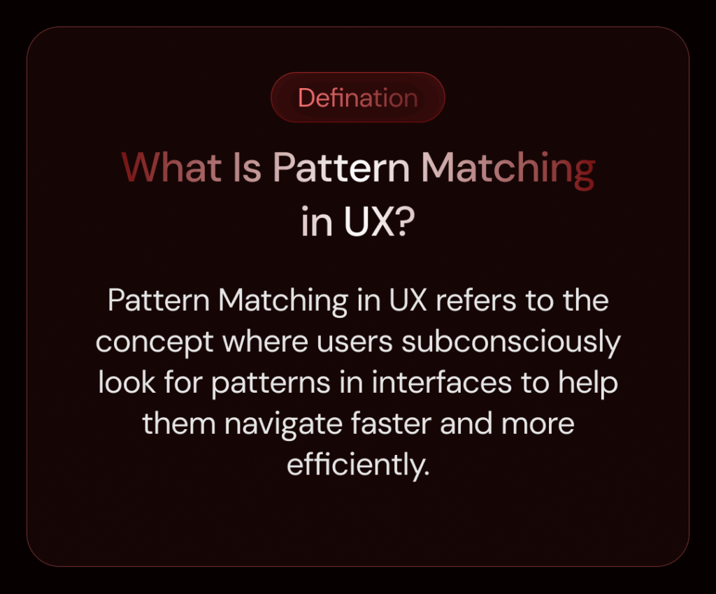
At its core, pattern matching in UX refers to the concept where users subconsciously look for patterns in interfaces to help them navigate faster and more efficiently. Think of it like this: humans are creatures of habit. When we see the same button in the same place or a similar layout across pages, we begin to build muscle memory for those actions.
The more consistent a design is, the less effort it takes for users to understand and interact with it. But the moment something changes unexpectedly, it breaks that flow. Suddenly, users are not just clicking—they’re thinking. And when users are forced to think unnecessarily, friction is created.
Why Does Pattern Matching Matter So Much?
Let’s say you’re designing an accounting software. On one page, you have the option to create an invoice. On another page, a user can create a quotation, and then a sales receipt. Now, imagine if the invoice page uses a clean layout with input fields stacked vertically, labels on the left, and a blue “Save” button at the bottom. But then the quotation page suddenly looks different: input fields are scattered, labels float above, and the save button is red and placed somewhere else.
That inconsistency means users have to stop and ask themselves:
- Where is the save button?
- Why are the fields arranged differently?
- Is this the same form as before?
Even if the functionality is almost the same, the user is now mentally overloaded. What should have been a smooth and intuitive action turns into a confusing moment. This is exactly the kind of scenario where pattern matching, or rather the lack of it, becomes painfully obvious.
How Pattern Matching Creates a Better User Experience
Good design is invisible. Pattern matching contributes to that invisibility. When a design follows familiar structures and patterns, users don’t need to learn from scratch every time. They recognize, rather than recall. Here’s how it helps:
- Faster Learning Curve: New users can grasp your system quicker if similar features behave and look the same throughout the interface.
- Lower Cognitive Load: Repetition and consistency reduce the effort required to operate your product.
- Increased Confidence: Users feel in control when they know what to expect.
- Reduced Errors: Familiar patterns help prevent mistakes, as users can rely on previously learned behavior.
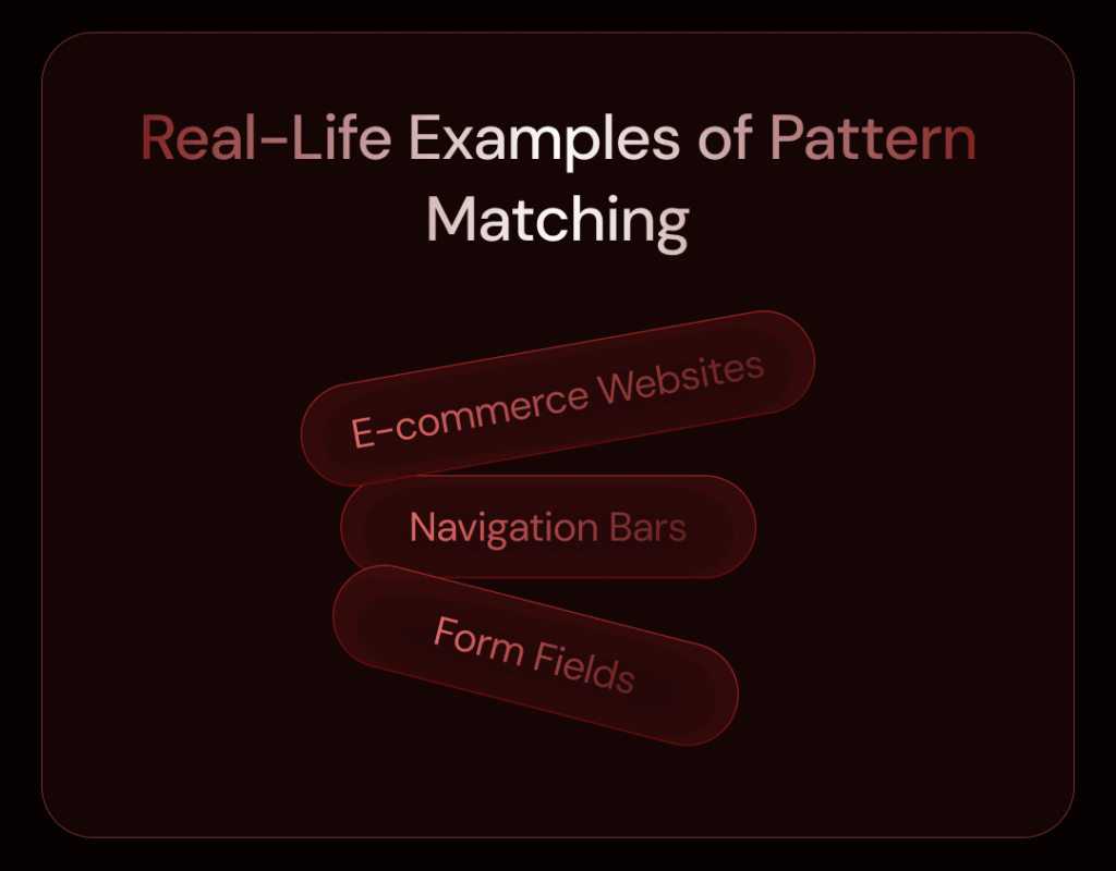
Real-Life Examples of Pattern Matching
Let’s explore a couple of real-world design patterns where pattern matching plays a key role:
- E-commerce Websites: Ever notice how product pages look nearly identical? That’s not laziness—it’s intentional. Whether you’re viewing a phone or a blender, the layout remains the same: image on the left, title and price on the right, description below, and an “Add to Cart” button in a bold color. Why? Because users get used to it, and the consistency helps them compare products without re-learning the layout each time.
- Navigation Bars: Imagine opening five different pages of a website, and every page has the navigation menu in a different location or style. That would be a nightmare. Instead, most websites keep the menu at the top or on the left, and the options stay in the same order. That’s pattern matching in action.
- Form Fields: Input forms (like for shipping, billing, sign-up, etc.) often follow the same order: name, email, address, phone number. Not because it’s a rule, but because it’s expected. Deviate from that order, and users slow down.
Pattern Matching in Product Design
Let’s say you’re building a dashboard. If every section of your dashboard has a card-style layout, with a title at the top, data in the middle, and action buttons at the bottom, then you’ve created a visual pattern. Now, when users interact with new sections of the dashboard, they already know where to look and what to do.
Same goes for icons. If you use a trash can icon to delete something in one place, don’t switch to an “X” or a “bin” elsewhere. Stick with it. Icons are powerful pattern cues, and swapping them out randomly breaks that visual trust.
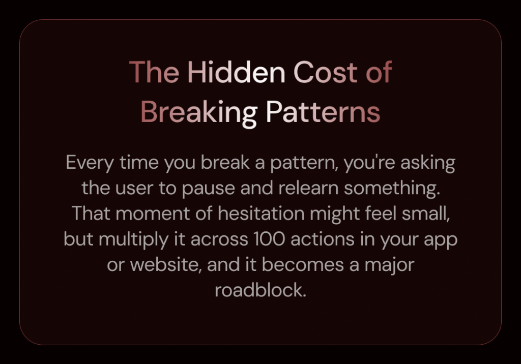
The Hidden Cost of Breaking Patterns
When designers try to be “creative” without considering consistency, they often end up confusing users. Think of it this way: creativity is great—but not at the expense of usability.
Every time you break a pattern, you’re asking the user to pause and relearn something. That moment of hesitation might feel small, but multiply it across 100 actions in your app or website, and it becomes a major roadblock.
This is especially important when designing tools that people use frequently—like admin panels, booking systems, dashboards, or anything that deals with complex workflows. The more a user sees repeated patterns, the easier and faster they become at using your product.
Designing With Pattern Matching in Mind
Here are some simple rules I follow to make the most of pattern matching in my designs:
- Audit Existing Interfaces: Before designing something new, look at what’s already been built. Are there patterns in layout, typography, icon usage, or button placement? Stick to them.
- Use Consistent Language: Don’t call the same action “Submit” in one place and “Send” in another unless there’s a clear reason.
- Copy Layout Structures: If you designed the invoice creation page one way, use the same layout for creating quotations or receipts. Don’t reinvent the wheel for every page.
- Maintain Visual Cues: Keep color schemes, iconography, and typography consistent across your design.
- Test With Users: Watch where users hesitate or get confused—that’s often a sign a pattern has been broken.
Final Thoughts
Pattern matching isn’t just about aesthetics. It’s about respecting the user’s time, mental effort, and expectations. When you design with consistent patterns, you’re giving users a smooth, intuitive, and frustration-free experience. It’s one of the most underappreciated pillars of great UX design, and once you start thinking in patterns, you’ll see opportunities for improvement everywhere.
So next time you’re designing a product page, a form, or a workflow—ask yourself: “Is this similar to what came before?” Because in the world of UX, similar is good.