Requesting a product demo sounds simple—until it isn’t.
At REVE Chat, the sales team relies heavily on product demos to connect with potential clients. Before any demo happens, users need to submit a request by filling out a form that includes their contact details and preferred demo schedule. On paper, the flow worked. In reality, the experience didn’t.
That’s where this redesign journey began.
The Problem: A Critical Step Hidden in Plain Sight

The existing demo request form followed a very traditional structure:
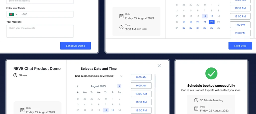
users entered their name, phone number, and email first, and only then selected a demo date and time.
From a UX perspective, this raised an important concern.
For B2B users—especially decision-makers with tight schedules—the date and time is the most critical part of the process. Yet in the existing design, this crucial step had the lowest visual and interaction priority. The form itself felt flat, outdated, and offered little guidance or reassurance.
Now imagine this scenario:
A user carefully fills out the form, entering all their personal and company details. Only at the final step do they realize the available demo slots don’t work for them. All that effort, wasted. The result? Frustration, drop-off, and a missed opportunity for both the user and the business.
To make matters worse, even after submitting the form, users received no clear confirmation. Was the demo booked? Did it go through? Should they wait—or try again?
These small UX gaps added up to a big problem.
The Insight: Schedule First, Details Later

The solution wasn’t about adding more features—it was about reordering priorities.
If time availability is the biggest constraint, then the experience should reflect that.
The redesigned form flips the flow by placing date and time selection at the very beginning. This allows users to instantly check their schedule before committing to anything else. It respects their time and reduces unnecessary mental effort.
This single change immediately makes the experience feel more thoughtful and user-centric.
Designing a Clear and Guided Experience

Once a user selects a date, a side confirmation card appears, clearly displaying the chosen day. This small visual feedback reassures users that their selection has been registered.
Next, users choose from available time slots—each aligned with a sales colleague’s demo capacity (typically 30 demos per day). The options are clear, focused, and easy to scan.
Only after a time slot is selected does the “Next Step” CTA become active. This interaction pattern acts as a natural guide, gently leading users forward without overwhelming them.
From Scheduling to Lead Generation—Smoothly

After confirming the schedule, users move on to the information form—name, email, company, and any specific demo requirements. At this stage, users are already confident that the demo time works for them, making them far more willing to complete the form.
A single “Schedule Demo” CTA finalizes the process, keeping the journey clean and distraction-free.
Closing the Loop with Confirmation and Confidence

Once the demo is scheduled, the experience doesn’t just end—it reassures.
A success message appears, clearly showing:
- Demo date
- Time
- Meeting duration
Along with a friendly message:
“One of our Product Experts will contact you soon.”

To make the experience even more helpful, users are given an option to add the demo to their calendar—reducing cognitive load and ensuring they don’t forget the meeting.
Why This Redesign Matters
This redesign wasn’t about making the form look prettier—it was about reducing friction, respecting user time, and increasing clarity.
By prioritizing what matters most to users, the demo request process becomes:
- Faster
- More intuitive
- More trustworthy
Sometimes, improving UX isn’t about reinventing the system—it’s about asking one simple question:
“What does the user care about most, right now?”
And designing from there.