Imagine going to a restaurant with a menu that’s 20 pages long. You flip through appetizer after appetizer, dozens of main courses, and a mountain of dessert options. It feels more like work than fun. Eventually, you either pick something at random or leave without ordering at all. That’s what decision fatigue feels like—and it’s a real problem in design.
I experienced something very similar in my professional journey recently. Last month, I had a meaningful conversation with Tuhin Bhai, who is the Lead UX Designer at REVE Chat. I wanted an expert opinion on the user experience of an accounting software project my team and I are currently working on. So, I shared the full user flow of the product and service creation module with him.
After going through the interface, one of his key observations was simple but powerful: “Rayhan, you’re giving the user too many decisions to make on a single page. They’ll get lost.” He was pointing to a screen where users had to make four separate decisions just to add a new product or service. At first, I thought, “Is four really too much?” But the more we discussed, the more I realized he had a point.
That conversation led me down a rabbit hole of research. I wanted to understand why having just a few choices could lead to such a bad user experience. That’s when I stumbled upon the concept of decision fatigue—a powerful but often ignored principle in UX psychology. What I discovered completely changed the way I think about designing user experiences.
What is Decision Fatigue?

Decision fatigue is when your brain gets tired from making too many choices. Just like your muscles tire after exercise, your mind tires from constant decision-making. The more decisions you make in a day, the harder each one becomes, until you start avoiding them, making poor choices, or shutting down altogether.
This concept explains why people default to fast food after a long workday or why we stick with the same brand, not because it’s the best, but because it’s easiest.
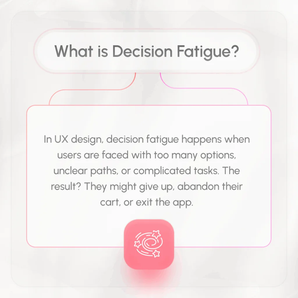
In UX design, decision fatigue happens when users are faced with too many options, unclear paths, or complicated tasks. The result? They might give up, abandon their cart, or exit the app.
How Decision Fatigue Shows Up in UX

Let’s look at how this plays out in real-world products:
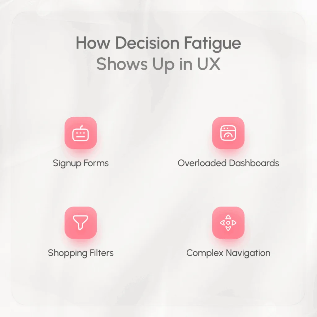
- Signup Forms: Asking for 10 pieces of information upfront feels exhausting. Users often abandon the form halfway.
- Overloaded Dashboards: Too many widgets, charts, and buttons create chaos. Users can’t figure out where to focus.
- Shopping Filters: Endless categories like price, brand, color, size, rating, shipping options… It’s too much to process at once.
- Complex Navigation: Menus with dozens of options can paralyze users who just want to find one thing.
In the accounting software I was working on, we were unintentionally causing the same problem. The product creation screen dumped multiple decision points on users all at once. Instead of guiding them smoothly, we were asking them to think too hard, and that’s not good design.
The Psychology Behind It
The reason behind decision fatigue is simple: the brain has a limited reserve of mental energy. Every time you make a choice, you use some of that energy. Over time, your brain starts to cut corners. You might start avoiding choices, making snap decisions, or picking whatever is easiest.
This is why users drop off when apps or websites feel “too much.” They’re mentally done. It’s not about laziness—it’s about survival. Our brains are wired to conserve energy, and if something feels mentally exhausting, we’ll abandon it.
Decision Paralysis: When Users Choose Nothing
One of the worst side effects of decision fatigue is decision paralysis. It’s when users face so many options that they can’t choose at all.
Think of a pricing page with six different tiers, each packed with features and conditions. Users may read them over and over, trying to compare—but in the end, they might just leave the site.
We see this all the time in digital products. Users hesitate, delay, or back out completely—not because they didn’t want to use the product, but because the decision was too hard.
How to Avoid Decision Fatigue in Your Design
Here’s how you can design smarter, keeping users’ mental energy in mind:
- Limit Choices Per Screen: Don’t overwhelm users. Focus on one or two key decisions at a time. If there are more, break them into smaller steps.
- Use Smart Defaults: Pre-select the most common option. This helps users move faster and makes the process feel easier.
- Highlight the Primary Action: Make the main button or next step clear and obvious. Use contrast, spacing, and simple wording.
- Progressive Disclosure: Only show advanced settings when needed. Keep the default view simple and clean.
- Break Long Forms Into Steps: Instead of a huge form, guide users through a few short screens. It feels more manageable and less intimidating.
- Use Clear, Simple Language: Avoid jargon and keep instructions easy to understand. Confusing terms only add mental load.
- Group Related Elements: Organize your interface logically. If something doesn’t belong together, don’t put it next to each other.
- Provide Visual Feedback: Let users know when a step is complete. Progress bars, checkmarks, and confirmation messages reduce uncertainty.
By following these principles, you help users stay focused, confident, and in control. You reduce friction, boost engagement, and create a better overall experience.
Final Thoughts
My conversation with Tuhin Bhai was a turning point. It made me realize that great UX isn’t just about beautiful interfaces or fast performance—it’s about protecting the user’s mind. Every unnecessary decision we force them to make drains a little bit of their energy.
Design should feel smooth, easy, and even invisible at times. When done right, users glide through your product, barely noticing how intuitive everything feels. But when decision fatigue creeps in, it’s like a wall—they stop, hesitate, and often turn away.
So if you’re building a product—whether it’s an app, a website, or software—always ask: “Am I helping the user decide, or am I making them work too hard?”
FAQ
What is decision fatigue in UX?
Decision fatigue in UX refers to the mental exhaustion users feel when they have to make too many choices while interacting with a product. It can lead to poor decisions, procrastination, or task abandonment.
How does decision fatigue affect users?
It makes users feel overwhelmed, frustrated, and less likely to complete tasks. This often results in higher bounce rates and lower conversions.
What are common signs of decision fatigue in a product?
Signs include high drop-off rates, skipped fields, abandoned carts, and user feedback about confusion or difficulty completing tasks.
How can designers reduce decision fatigue?
Simplify user flows, reduce unnecessary options, break tasks into steps, use defaults, and ensure a clean, clear interface.
Why is decision fatigue important in UX design?
Because every decision takes mental effort. Good UX preserves that effort, helping users complete tasks smoothly without getting overwhelmed.
