Spoiler: It’s not about speed — it’s about flow.
“It doesn’t matter how many times I have to click, as long as each click is a mindless, unambiguous choice.”
— Steve Krug, Don’t Make Me Think
Ever clicked around a website and found yourself getting annoyed—not because it was hard, but because it just didn’t make sense? Maybe you were doing something as simple as logging in or sending money, and yet, there was this one extra step that made the whole thing feel… clunky.
We’ve all been there.
Clicks are everywhere—every tap, every press, every little interaction we have online or in apps. But here’s the thing: not all clicks are created equal. Some feel smooth, natural, and barely noticeable. Others? They feel like speed bumps in your journey—unnecessary, frustrating, and sometimes just plain dumb.
As someone who spends my days designing software, I’ve learned that even a single click can make or break a user’s experience. And no one puts it better than Steve Krug, the usability guru himself, who reminds us that it’s not about the number of clicks—it’s about how easy each one is.
In this article, I’ll walk you through two real-life situations from my daily workflow—times when clicks really mattered, and not in a good way. These examples may seem small on the surface, but they highlight a much bigger issue in digital design: when extra clicks become more than just a minor inconvenience.
Let’s dive in.
Example 1: The QuickBooks Pop-Up That Won’t Go Away

Lately, I’ve been designing an accounting module for our ERP software. To get ideas and learn from others, I often check out what competitors are doing. One of the biggest names in accounting software is QuickBooks.
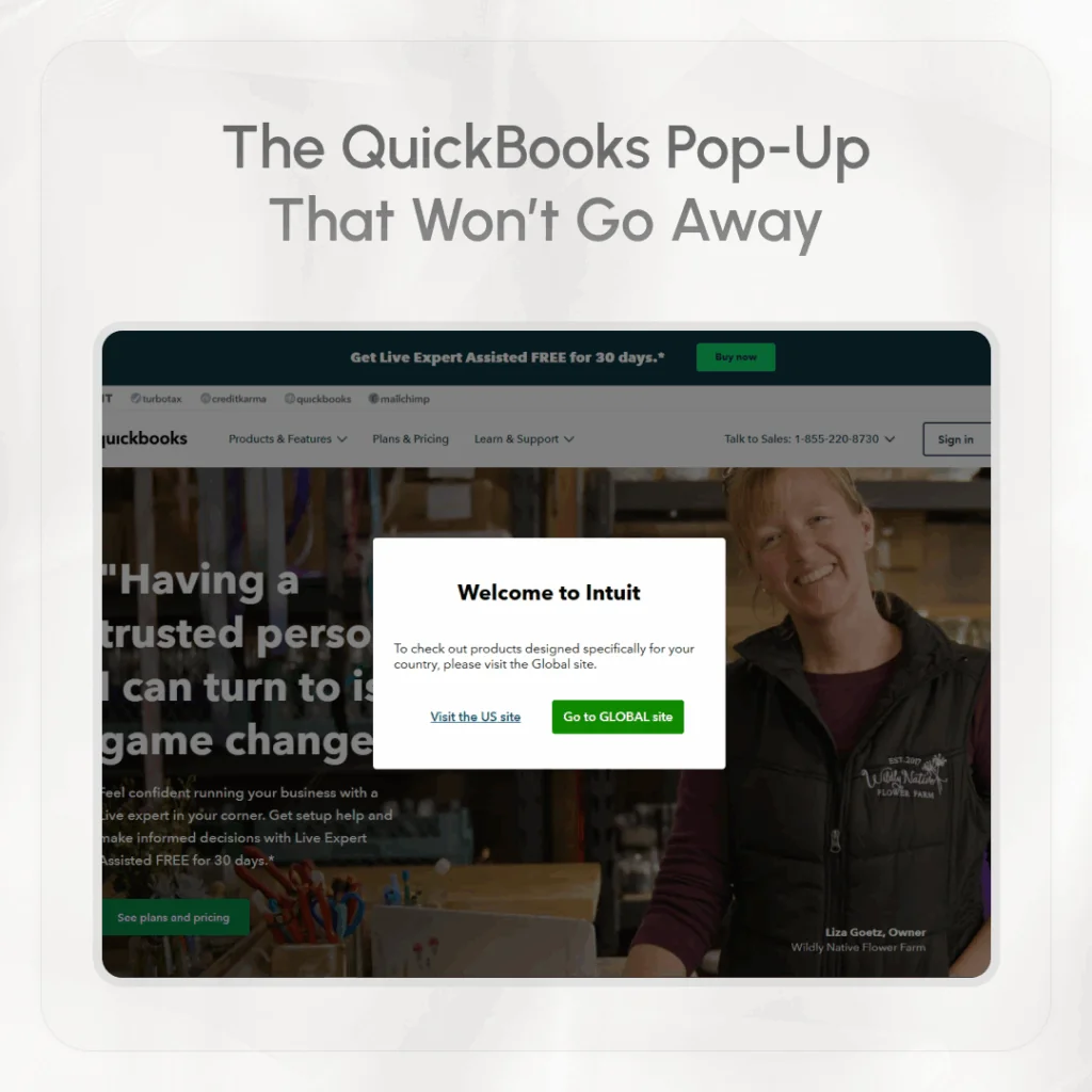
Whenever I want to explore their platform, I usually search “QuickBooks” in Google and click on their main website: **https://quickbooks.intuit.com/**. That’s where the problem starts.
Every single time I land on their homepage, I get a pop-up message that says something like:
“To check out products designed specifically for your country, please visit the Global site.”
Then I have to choose—do I want to continue on the US site or go to the Global one? There’s no memory of my last visit, and no option to skip this message. It just keeps coming back, every time.
At first, it’s just one small click. No big deal, right? But imagine doing this five, ten, or twenty times a week. That little pop-up starts to feel like a roadblock. It doesn’t help me—it just slows me down. It’s an unnecessary step that could easily be avoided if the site remembered my choice.
This is a perfect example of a bad click. It’s not mindless. It’s not helpful. It interrupts my task instead of making it easier.
Example 2: My Prime App and the Extra Step That Shouldn’t Be There

Let me tell you about another frustrating experience—this one from my mobile banking app.
I have an account linked to the Prime app, and I often use it to transfer money. Since I only have one account connected, it should be simple, right? The app should automatically pick that account when I go to send money.
But no.
Every time, I have to tap the “From Account” field and then tap again to select the only account I have. Why? There’s no need to ask me the same thing over and over again. The app already knows which account to use. It should be smart enough to auto-select it for me.
This kind of design might seem small, but it affects the user experience in a big way. When users have to repeat the same steps again and again for no reason, it becomes annoying. The app feels less helpful, less smooth.
Here again, we see what Krug was talking about: a click that requires thought, even when it shouldn’t. It breaks the flow. It makes the app feel like it’s not paying attention to me.
So, Does Click Really Matter?

Let’s answer the question plainly: yes and no.
Yes, it matters if those clicks:
- Require mental effort or decision-making where there shouldn’t be any.
- Happen over and over again without learning from the user.
- Interrupt the flow of the experience.
- Are avoidable but still present.
No, it doesn’t matter if the clicks:
- Are quick, intuitive, and unambiguous.
- Help the user feel in control.
- Are steps in a clear, logical path that builds confidence.
- Make the interface feel clean rather than overloaded with options.
In fact, sometimes more clicks can improve usability. Imagine an e-commerce site that asks you to confirm your shipping address, payment method, and delivery option in separate steps. That might be three extra clicks—but each one is simple, focused, and keeps the process clear. That’s good UX.
Why This Matters in Design
When designing websites or apps, we sometimes focus too much on reducing the number of clicks. We try to make everything super fast. But speed isn’t everything.
Think about it like this: Would you rather take three easy steps to reach your goal, or one confusing step that makes you stop and think?
Users care more about feeling in control than saving one click. A good design should guide them smoothly, like a gentle hand on their back. It shouldn’t make them pause, wonder, or guess.
That’s why we need to design for the user’s brain, not just their finger. The fewer decisions the user has to make, the better the experience will feel—even if they’re clicking more.
What We Can Learn from This
Let’s go back to the two examples:
- QuickBooks website: Don’t annoy users with pop-ups that repeat every visit. If they choose something once, remember it.
- Prime app: If a user only has one account, pre-select it. Don’t ask them to do extra work for no reason.
These may seem like small things, but together they shape how a user feels about your product. And feelings matter a lot when it comes to user experience.
If your product is easy to use and doesn’t make people think too much, they’ll keep coming back. If it feels like hard work, they’ll start looking for other options.
Final Thought
So, does click matter?
Yes—but not in the way you might think. It’s not about counting how many times someone has to click. It’s about how each click feels.
If your clicks are smooth, clear, and feel like the natural next step, users won’t mind them at all. But if they feel like work—if they stop the flow—then even one extra click can ruin the experience.
As Steve Krug wisely said, it’s all about making sure users don’t have to think too much. Keep it simple. Keep it clear. And above all, make every click count.
